Creating a dynamic brand for a Hong Kong start-up, offering affordable multi-use property investment space.
Kubes is located in thriving neighbourhoods, it is in close proximity to public transport and offers the most cost-efficient way to own real estate in Hong Kong.
We were approached by the start-up client, Kubes to help launch their business and deliver a full suite of brand services. We also collaborated with Kubes to help market their business to the right target audience.
Client
KubesDate
2018Services
Brand Identity / Logo Design / Brand Guidelines / Business Card & Stationery Design / WordPress / Web Design / Online Marketing
A bird's eye view perspective
We created a symmetrical brand identity, based on a grid system and drawn from a bird’s eye view perspective of the Kubes property.
Color and Material
We chose a colour for the Kubes brand that will be trustworthy for investment but at the same to feels like a luxury home lifestyle brand. We paired this with two darker tones to create a contrast and make the main brand stand out.
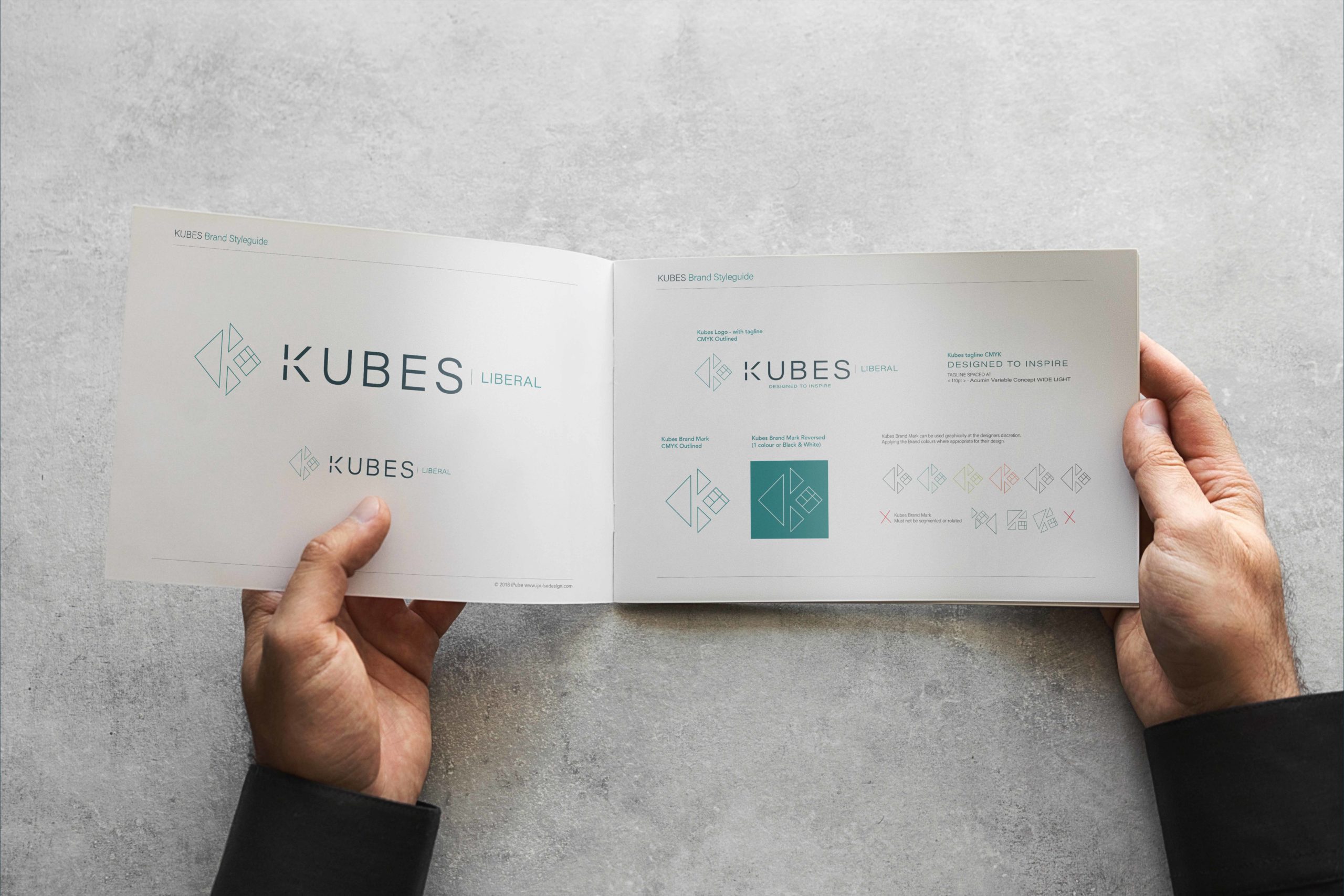
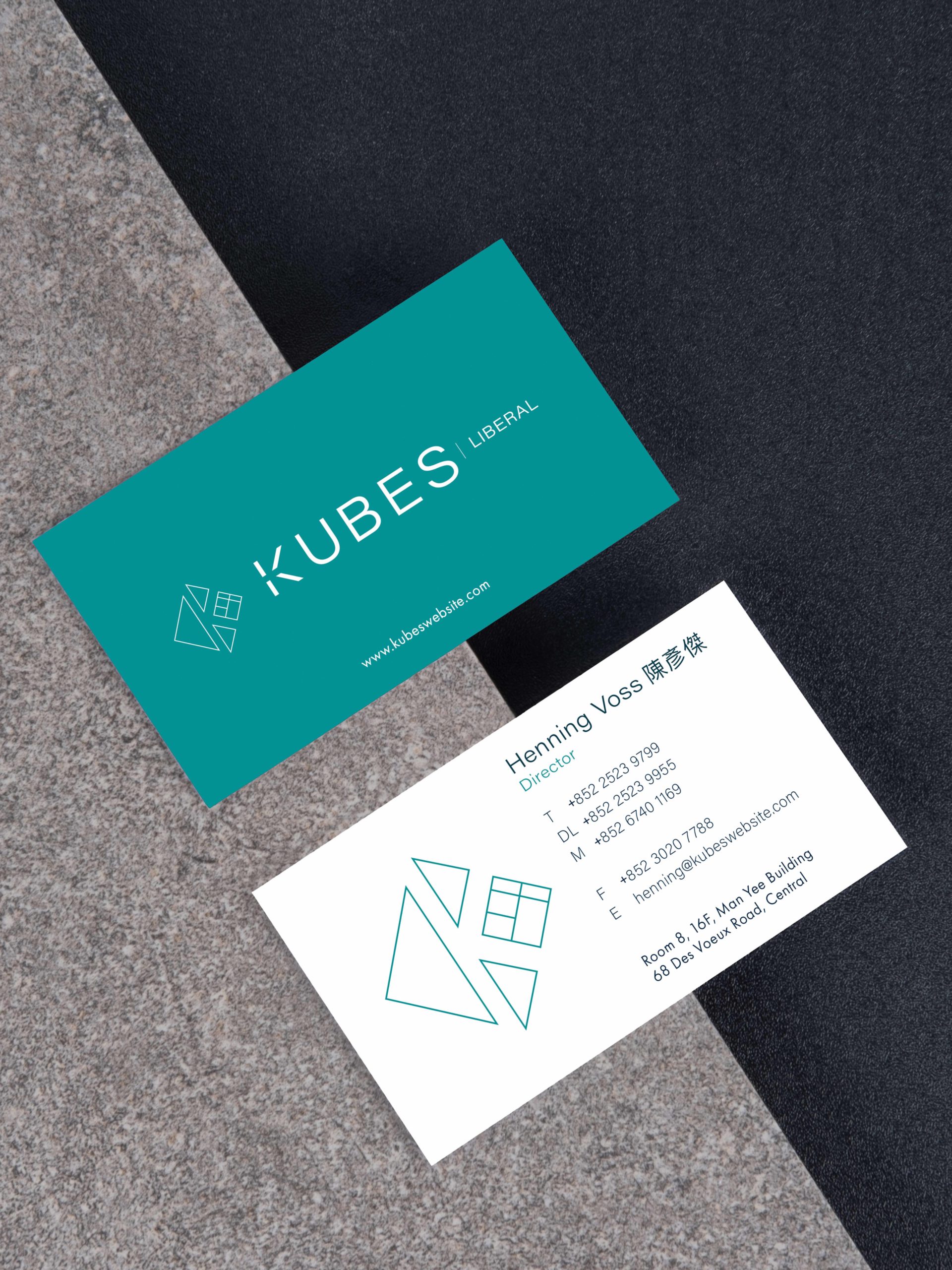
The challenge: create a forward-thinking brand identity that will work as more sub-brands are added.
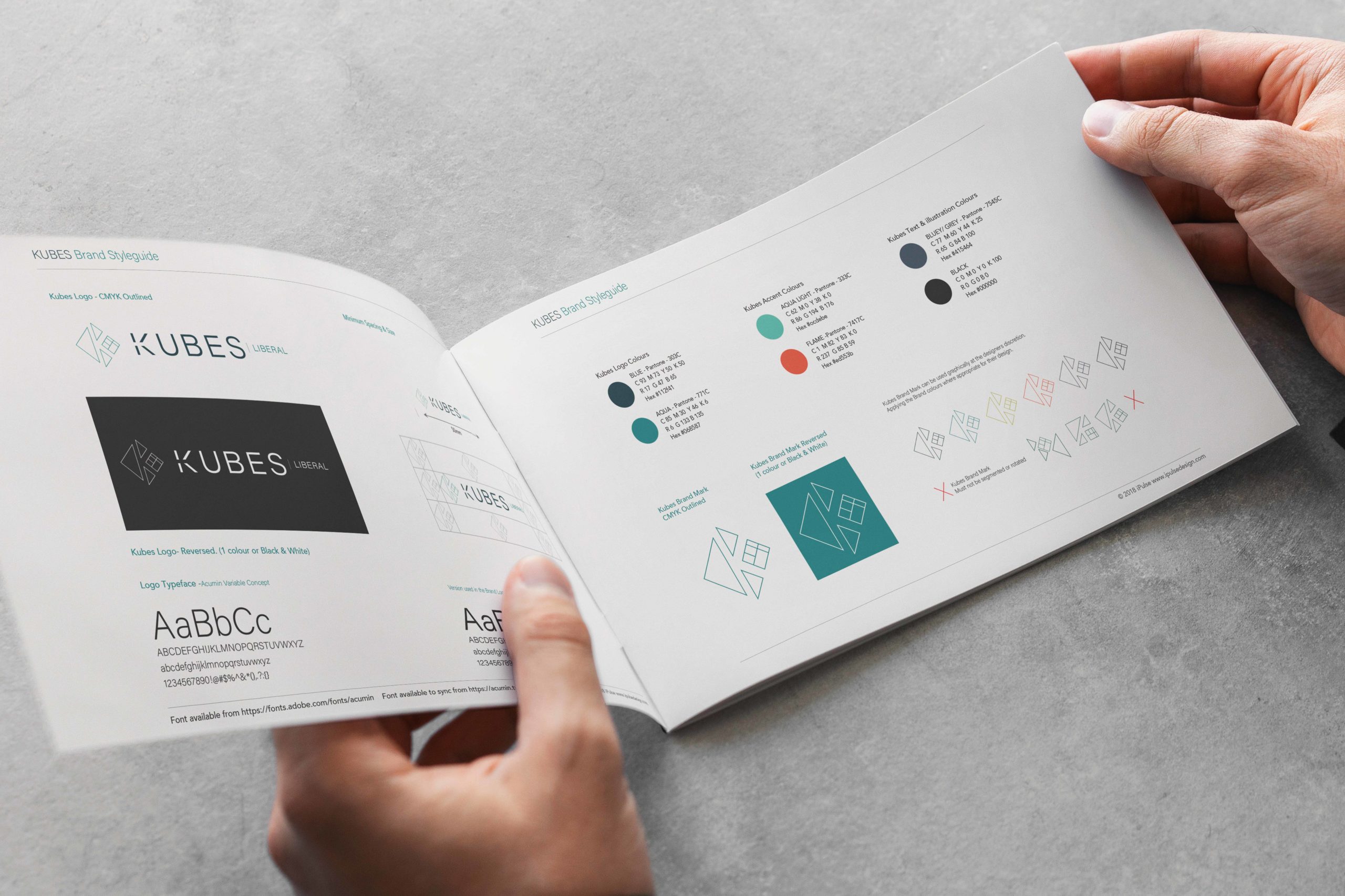
The challenge was to create an Identity for “KUBES” and show the client how the names of the individual developments can be added as the company grows.
*Opposite is KUBES | Liberal, the first development and sub-brand.
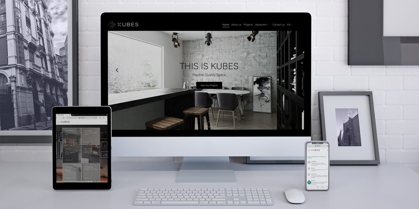
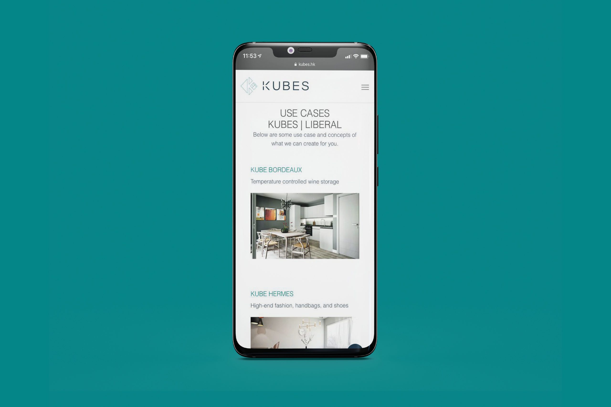
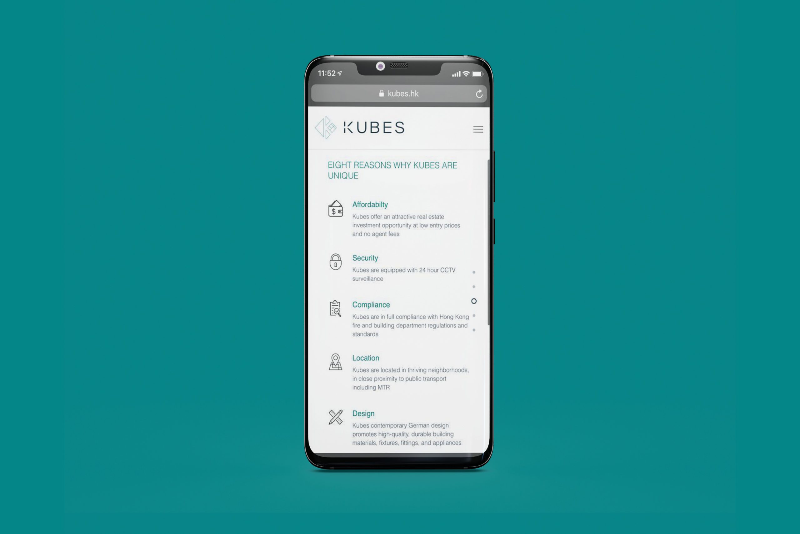
The solution: a fully responsive WordPress website that showcases the client's full suite of services.
Mutually the brand was brought forward through their brand collaterals, a comprehensive style guide, and their corporate communication and marking collaterals.
