There are many ways to approach company logo design. For years it had been the job of a skilled professional. They would start with a pencil, listen to your passion and share your vision for your company. They would then translate that in a single embodiment of the who, the what, and the why.
With the rise of DIY logo creation software, AI-focused tools to predict a series of probable outcomes of your logo make it easier for anyone to visualise an idea for a brand.
The problem lies here; free online tools are suitable for people who aren’t serious about what they’re about to embark on. They are a means to an end, and 99% of the time, you end up with a logo design that looks exactly what it is. Free.
What are we trying to say here? That the process of authentic logo design still harvests the most remarkable results. It’s a journey between designer and client, vision and creation, invested time, and output quality.
So on that note, here are some of our favourite logo designs from the past few years. They have all been designed in partnership with the business owner and with a start-up budget in mind!
Adrian Li & Co,. Solicitors (Hong Kong)
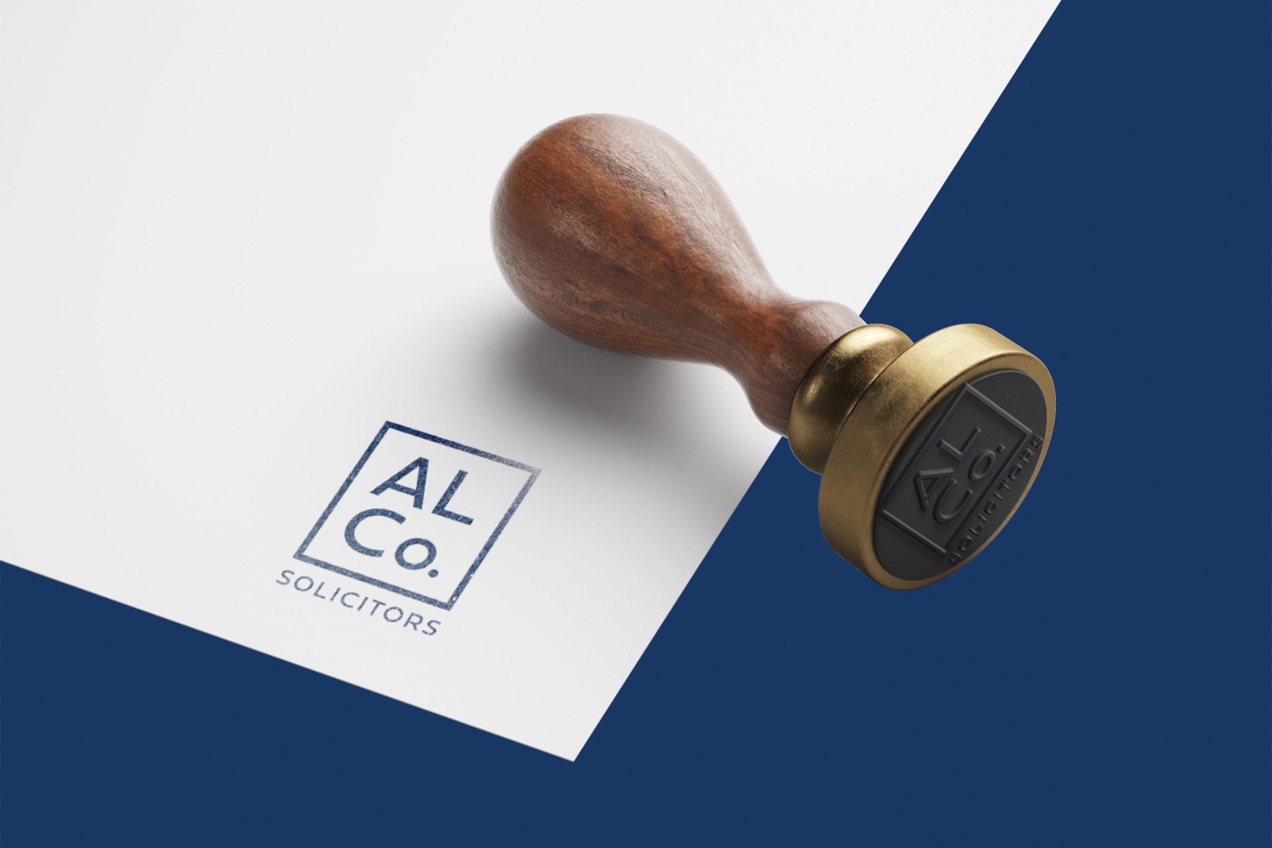
Adrian Li & Co,. Solicitors came to us looking for a creative logo design as part of their new company launch. As an emerging boutique law firm in Hong Kong, they were particular about leaving the stuffy corporate image of law. Opting for a fresh contemporary look that offered something different.
We spent time analysing the competitive landscape of law across Hong Kong to see how best to position the company—opting for a typography-based logo our graphic designers set to work to produce two orientations of the company logo design.
Many law firms stay traditional with their choice and go with a formal, serif font as the logo’s primary font. We were looking to focus more on the contemporary side of the companies image and chose a trusting sans serif font. Displaying the company name in all caps gave us control over the overall height of the logo, drawings attention to the title first and the industry second.
We created the second lock-up as a modern alternative to using the full landscape version. With a company chop/stamping being a popular signature form in Hong Kong, we wanted to develop a professional and forward-thinking secondary asset. We achieved this by abbreviating the company title and encapsulating the stacked letters.
Throughout this process, we experimented with colours but had clear direction from the client that blue was the desired route for a few reasons, both personal and professional. This helped with the efficiency of the project as we were able to communicate back and forth without straying off course.
The result was a set of logos that truly represented what the company stood for in the market. The process helped shape the vision for the brand and gave us the ability to move forward, further developing the brand across business cards & stationery, web design and PowerPoint presentation design.
Read more about the Adrian Li & Co,. Solicitors project.

Niseko Car Club (Japan)
It’s not every day a luxury car club knocks on the doors looking for a logo design company. They aim to become the go-to place in Asia for car enthusiasts to meet like-minded people and share unforgettable experiences.
Based in Japan, the Niseko Car Club offers touring, event planning and hosting; right through to facilitating acquisitions, storage and regular maintenance.
Our job was to embody the passion of the company and the services they offer into a contemporary, luxury logo design that upholds trust, dedication and quality in everything it does.
We knew that icon and colour would be vital to getting right, so we started there. Looking at what ideas and emotions we felt when analysing a variety of luxury brands across many different industry sectors. Settling on black & gold as the primary colours, we could start visualising how the logo could apply to the broader realm of Branding.
The official flag of the region features a circle with two horizontal marks. We took inspiration from that, combining it with Mt Yotei and adding the picturesque roads inside the ring. Paired with a locally appropriate font, suitable for translation and with a luxury feel, we created the Niseko Car Club logo.
After creating the company logo we went on to create a custom WordPress website and developed a series of Brochure Design.
Read more about the Niseko Car Club project.

Habitat Hokkaido (Japan)
A developing real-estate company offering bespoke services and land & property sales based in Hokkaido, Japan. They were looking for a creative logo design to bring some eye-catching localisation to their business.
With little else to work with other than the name, we set out to become the best logo design company on the market!
We began by researching competitors in the market, understanding what worked, what didn’t and how we felt we could best position Habitat Hokkaido in the real-estate marketplace.
From searching through Japan’s many distinctive and culturally unique art styles, we soon found our inspiration in woodblock printing typical of the ukiyo-e artistic period.
With that in mind, we then began developing a logo mark, an icon that would serve as the company logo in the future. We proposed many different concepts with meanings personal to the company owners and what we felt would work within the industry before settling on a traditional Japanese-style house.
The colour red was always going to be accurate to our woodblock printing reference from our initial discussions. We paired that with an Asian-inspired typeface, which wasn’t too Japanese in class but had elements we liked that lent themselves well to the style.
We created both a portrait and landscape logo lock-up for Habitat Hokkaido, which, in this case, was enough to accommodate the Infographics and marketing applications they had planned.
Qantex Capital Markets (Hong Kong)
As a financial start-up in Hong Kong, Qantex Capital Markets searched for a trusted logo design company. The founding partners were looking for a creative design agency that had a Western design style.
The company logo design process started with a verbal brief. The client’s wish was to create a brand mark that would reflect the business’s global presence.
Our Graphic Design team developed a sphere representing the globe. The vertical and horizontal “swooshes” symbolise the office locations. (Sydney, London, New York & Hong Kong.)
By using gradients and allowing the logo to be transparent was a direct reflection of the business. Their ethos was to have an open investment model.
The pallet of blues we chose balanced a trusted navy for finance with a brighter sky blue, conveying the fresh start-up and new outlook that the business brings to its clients.
The team looked at a range of font styles, deciding on a modern Sans Serif. The logo arrangement allows the primary brand name “QANTEX” and the outstanding logo mark to attract the focus.

Ascent Real Estate Investors (China)
With capital equity consisting of US$470 million, it is impossible not to get excited when the Carlyle Group’s ask for a company logo design.
With the client based in Shanghai, we were briefed verbally over the phone and sent a prospectus on the business. They were clear in that they wanted a creative logo design that appealed to an international market. They expressed that they wanted the team to have significant experience Branding western companies when choosing a creative agency in Hong Kong. Luckily, we had a wealth of experience with a portion of the team trained in the UK.
As we always do, we start with Market Research. Learning as much as we can about the industry, competitors, company strengths and the visions for where they want to be in 10 years.
We then progressed into the initial concept stage of the company logo design, looking at how to represent the company values best whilst considering the research. We proposed a logo mark based on the architecture that aligned with the companies industry. We were conscious of looking too much like a construction company, so we worked hard to develop a way to incorporate the upward growth in wealth and investment.
As they were operating across multiple countries, font and Translation were necessary for the logo design. We made sure that whatever we created was agile enough to apply to different markets. We chose a versatile serif font, paired with a sans serif giving the flexibility we needed to use across the brand.
The result was an abstract logo mark that the company felt symbolised their mission and vision as a brand. We subsequently went on to produce marketing materials for the following years and have recently completed a new creative logo design project with The Carlyle Group.

Kubes (Hong Kong)
Located in thriving neighbourhoods close to public transport and offering the most cost-efficient way to own real estate in Hong Kong, Kubes needed a dynamic logo design that targeted both B2B and B2C markets.
Taking inspiration from their industry, we focused on building management, architectural plans and building blueprints. We started to look at the division of shapes and how the floor plan was subdivided into commercial units.
We knew that creating a symmetrical logo design based on a birdseye view of the Kubes property was what we wanted to achieve.
The logo mark harnessed that concept and incorporated the units interested parties could purchase. Our designers even managed to include the capital K within the centre of the design. Although not evident at first, it created a clever talking point when asked about the concept.
We knew they had plans for expansion from speaking with the business owners, so we created this logo design with flexibility in mind. Using the same creative logo design across multiple locations meant considering how different neighbourhoods could share the logo and push their own identity.
KUBES | Liberal, the first development and sub-brand that followed the main logo design.
Rounding off the design process, we chose blue for the Kubes brand. It reflected trustworthiness for investment and a luxury home lifestyle brand.
For more information on how we can help start-up companies with creative services check out our blog post here
Serious Start-Up Checklist 2021
Alternatively, if you’d like to get in touch about how ipulse can partner with your business please fill in the contact form send an email or give us a call.


