As creatives, the hardest part of the job is trying not to reinvent the wheel. As a graphic design agency and as designers we all want to leave our mark, to expose tired brands to new ways of thinking, new influences, new trends we have seen or visions we have seen for the future of the industry. Certainly for our clients, we want to help keep the ball rolling in the right direction for our clients and ultimately ourselves.
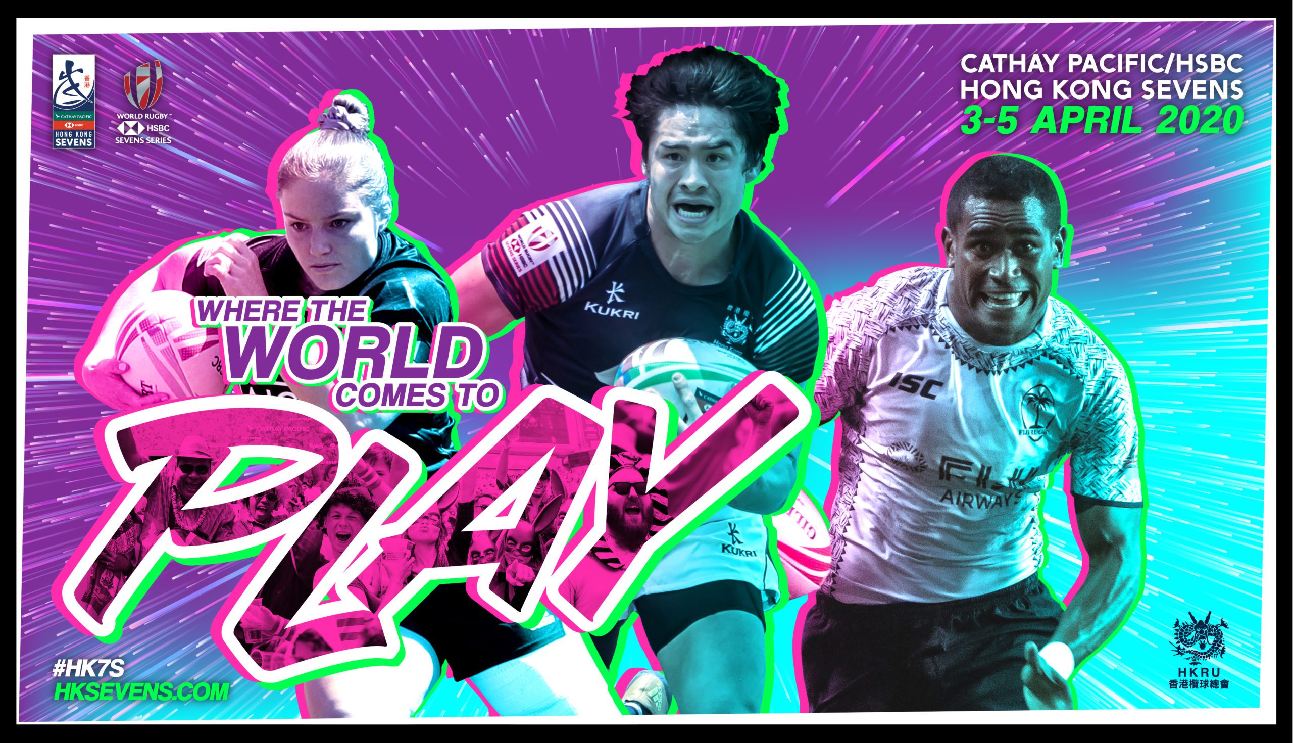
The Hong Kong Sevens is the largest, most prestigous and ultimately the biggest stop on the World Sevens Series. It has been a mainstay in the events calendar since 1976 and has grown year on year since then to become the mega event it is today. It’s the bench mark of quality that other tournaments look to around the world so, naturally, with that comes an essence of pressure with how to handle the brand.
The 2020 brief was pretty much the same as the previous year.
Reflect the energy of the tournament! The fast-paced nature of sevens rugby, the vibrancy of the city and the party spirit of the spectators.
*You can’t use green and you can’t use red, oh and players with conflicting shirt sponsors won’t get through either. Also, try and get a qualifying team, a women’s team and a world series team on there too!
We have a laugh with the team every year on the small print of the project. On one hand, it’s an inhibitor but on the other, it pushes you to get creative, problem solves and get out there to look for inspiration!
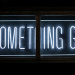
I like to think the inspiration for this years tournament key visual came from a mix of different sources. The neon signs of Hong Kong, superhero movies and 80’s film posters, screen printing techniques and probably a few subconscious elements thrown in there.
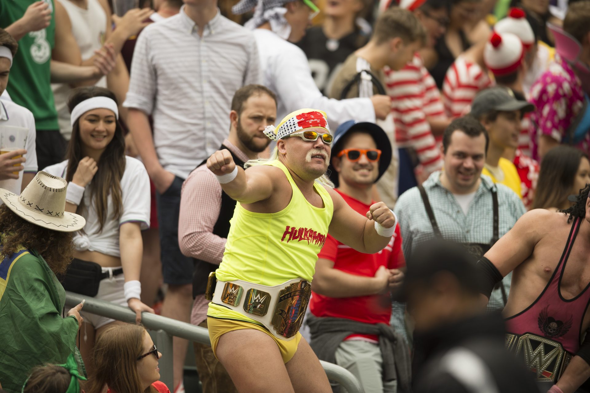
Capturing the atmosphere of the weekend is always a challenging one. Searching through hundreds of crowd shots looking for that diamond in the rough, the total embodiment of the weekend, the perfect moment. Slim chance of it happening and if it does, how then do you work that into your vision of how this is going to look?
To cut a long trial and error process short. This is how we did it.
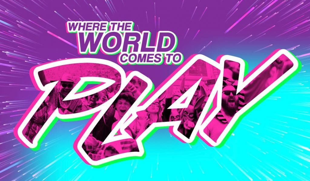
The Hong Kong Sevens tagline is “Where the world comes to play”. The word “play” reflecting the sevens rugby on the pitch and the fun aspects happening elsewhere. It’s a clever title and one which we have been happy to stick with over the years. So with the main focus of the visual being around the rugby players (for obvious reasons), we developed a new way to incorporate the fans, atmosphere and spirit of the tournament, and that was through the tournament tagline lock-up.
![]()
![]()
A subtle yet interesting way of building the fans into the key visual resulted in quite a unique brand for 2020. As a marketing agency, we love assets. Elements from a visual we can either use ourselves or pass on to third parties to have at their disposal and get creative with. Even without the rugby players in the visual, you can tell it’s part of the Hong Kong Sevens tournament branding and that gives digital agencies, marketing agencies or web agencies the freedom to take their projects further.
We are very privileged to have the Hong Kong Sevens and the Hong Kong Rugby Union as a client and we wish them all the best with this year’s event.
To see more on this project please go to Hong Kong Sevens Tournament Branding
Or go back to view some of our other works here