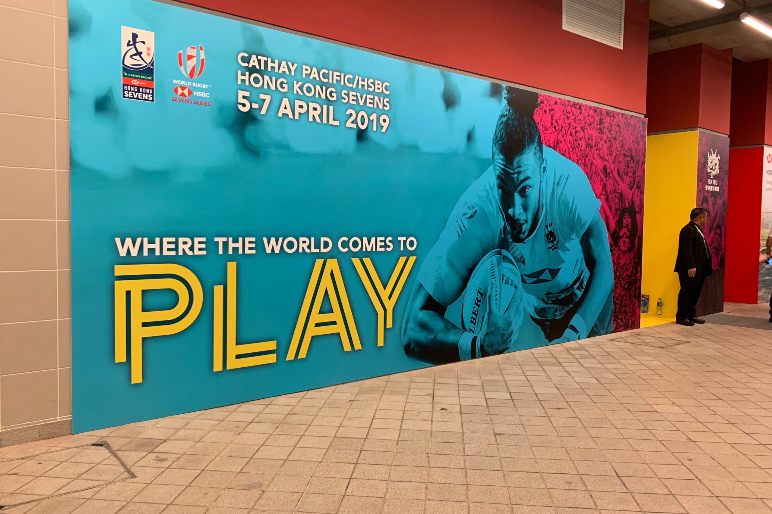
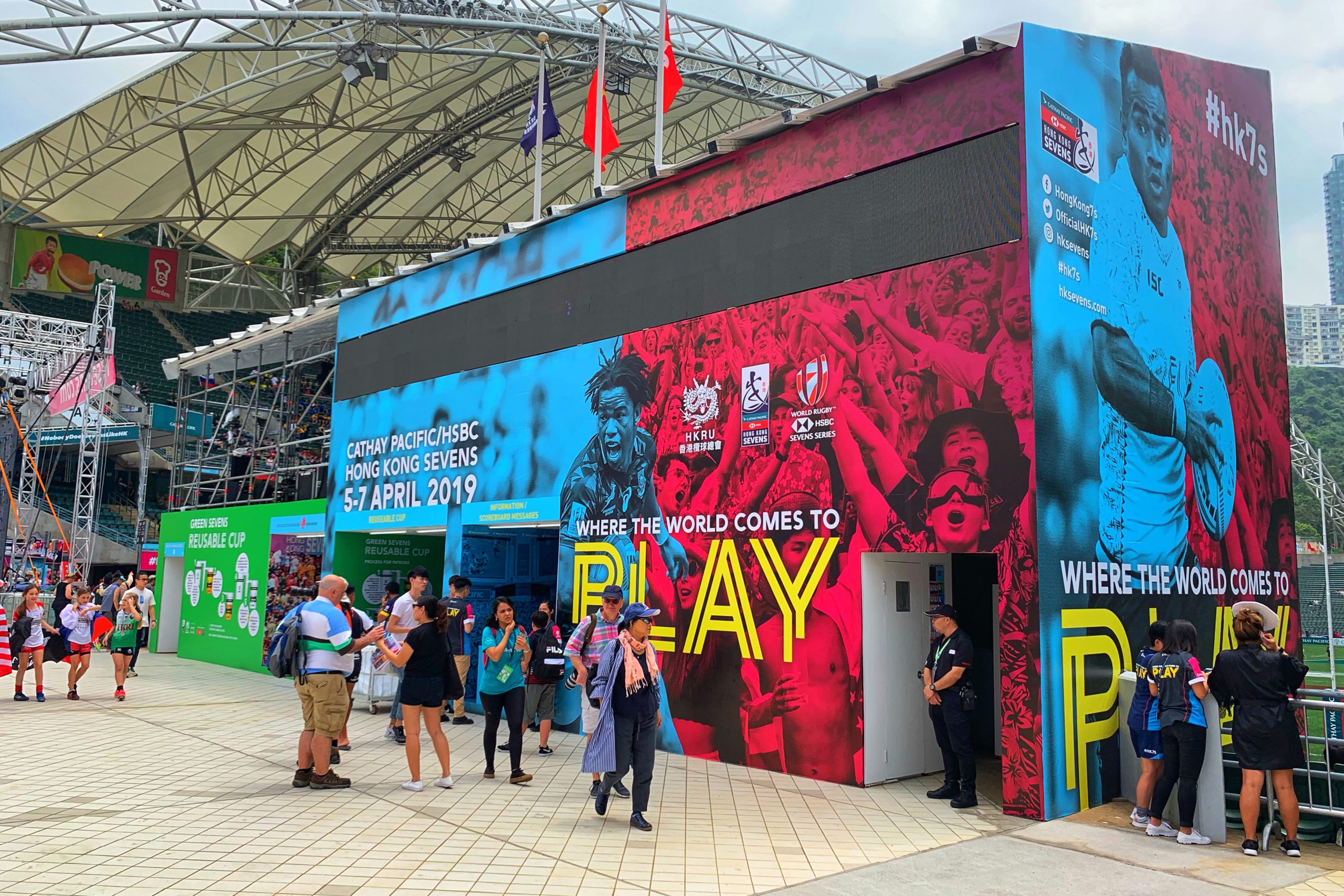
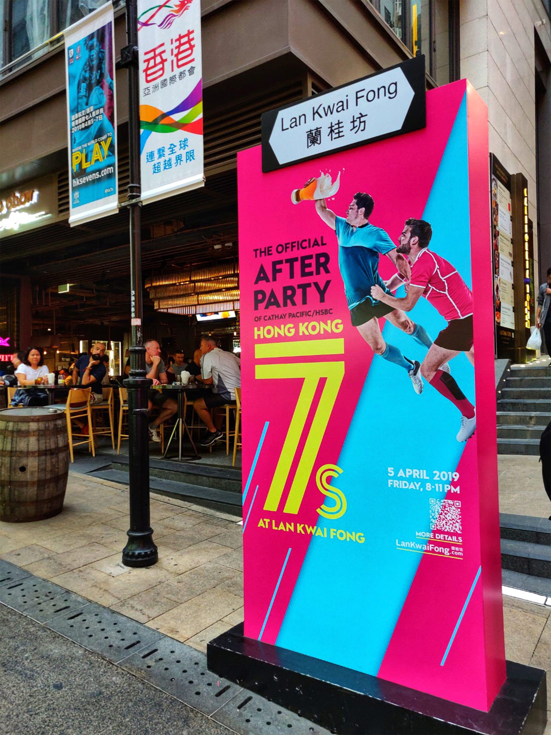
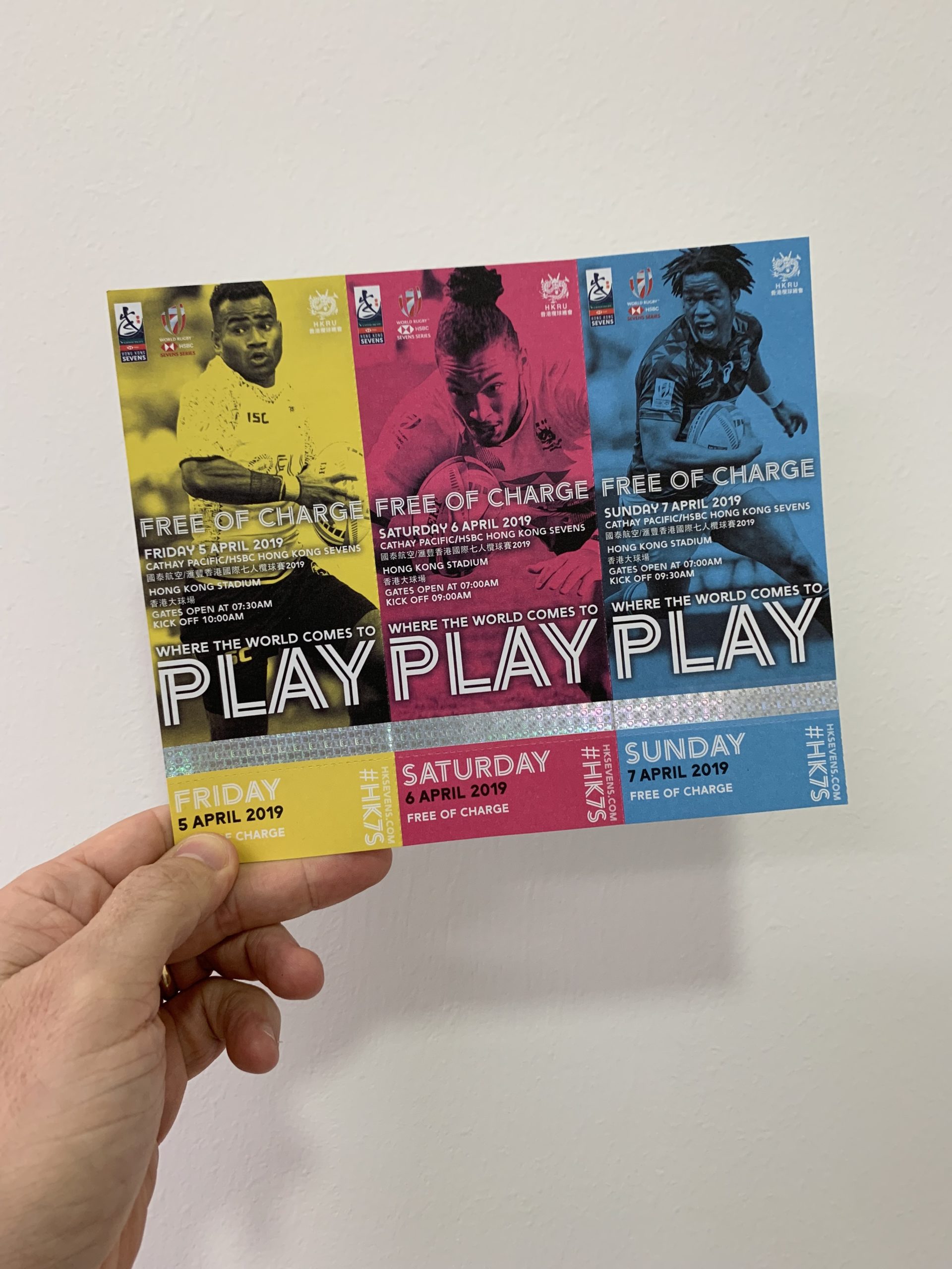
Branding the biggest event in Hong Kong’s sporting and social calendar for the third year!
Firmly established as the world’s premier event of its kind. One of the most popular annual sporting events in Asia, the Hong Kong Sevens attracts some of the world’s greatest rugby players and thousands of fans from every corner of the globe.
We had the privilege of working alongside the great team at the Hong Kong Rugby Union to bring this event to life. As their creative design agency in Hong Kong, we were there to ensure the visuals impacted as strongly as the tackles!
Date
2019-21Services
Brand Identity / Brand Guidelines / Key Visual Creation2020
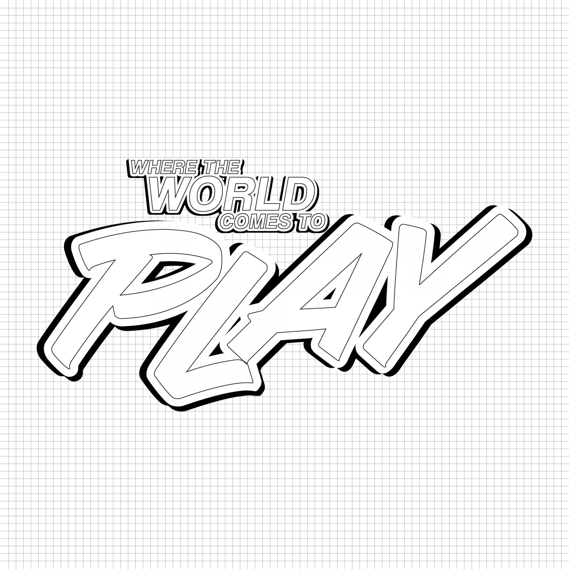
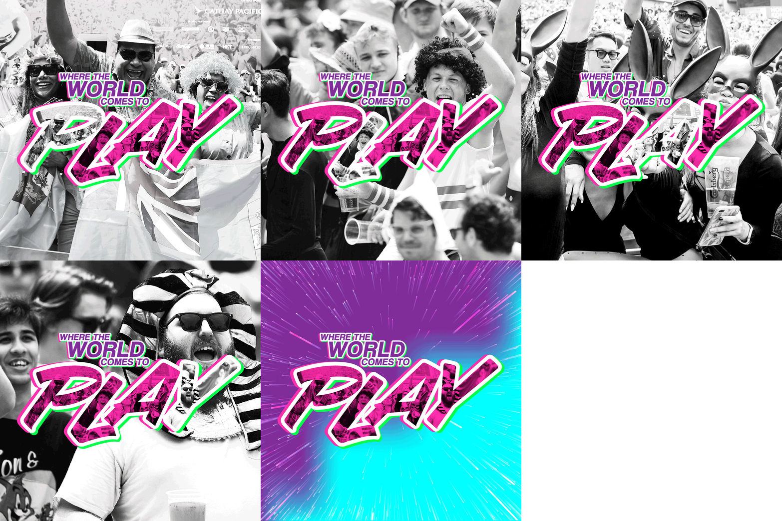
A subtle yet interesting way of building the fans into the key visual resulted in quite a unique brand for 2020.
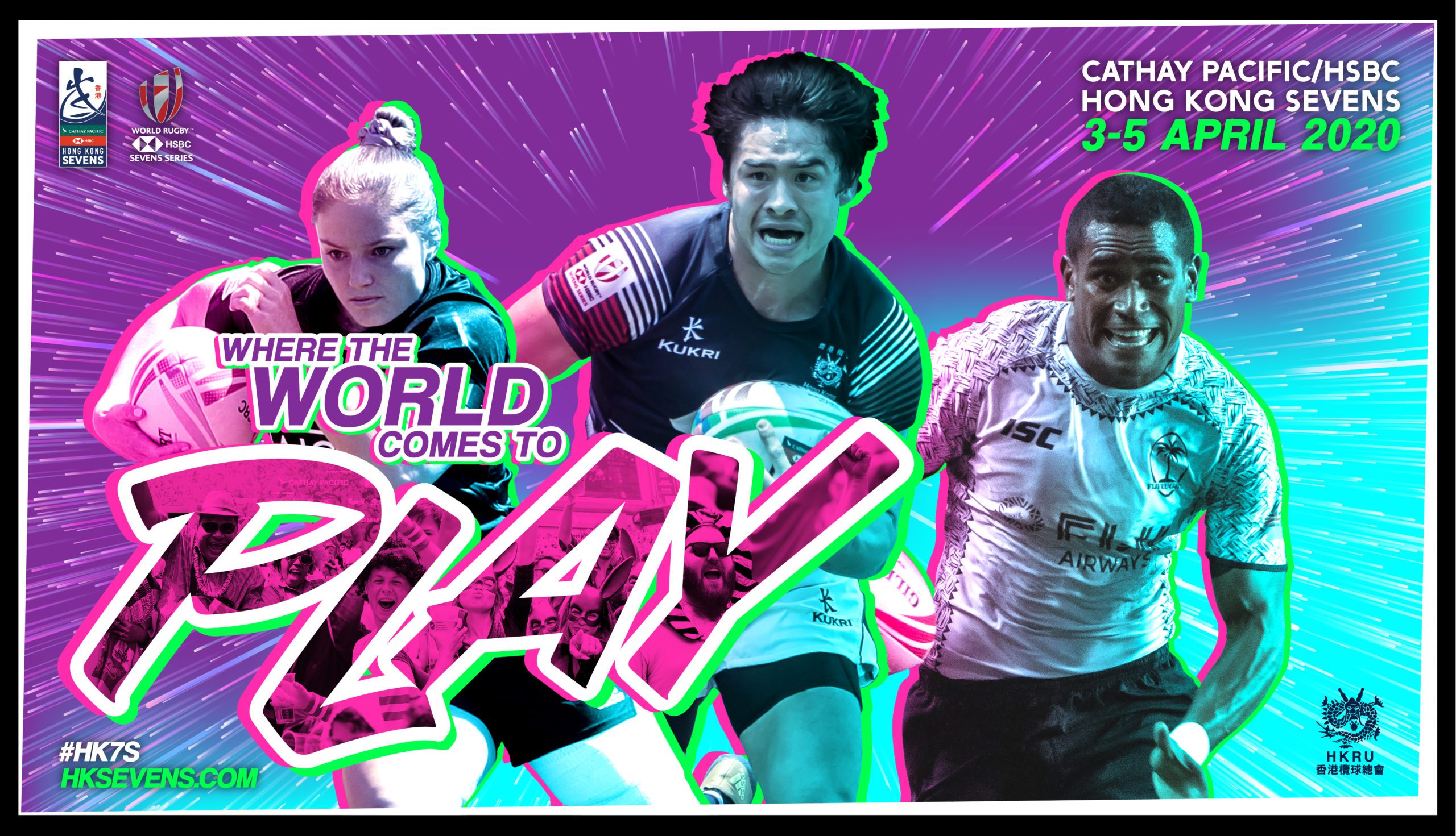
Create a key visual for Hong Kong's biggest event which captures the #HK7S
As a branding agency in Hong Kong, we focus on being able to consistently deliver unique brand experiences for events starting from the key visual through to a full suite of brand assets.
The inspiration for this tournament key visual came from a mix of different sources. The neon signs of Hong Kong, superhero movies and 80’s film posters, screen printing techniques and probably a few subconscious elements thrown in there.
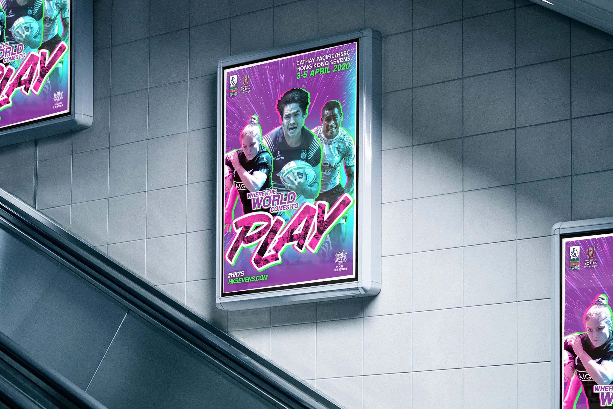
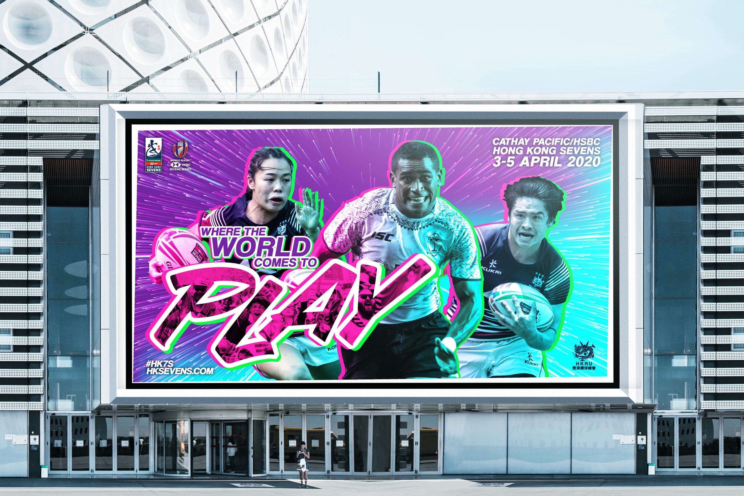
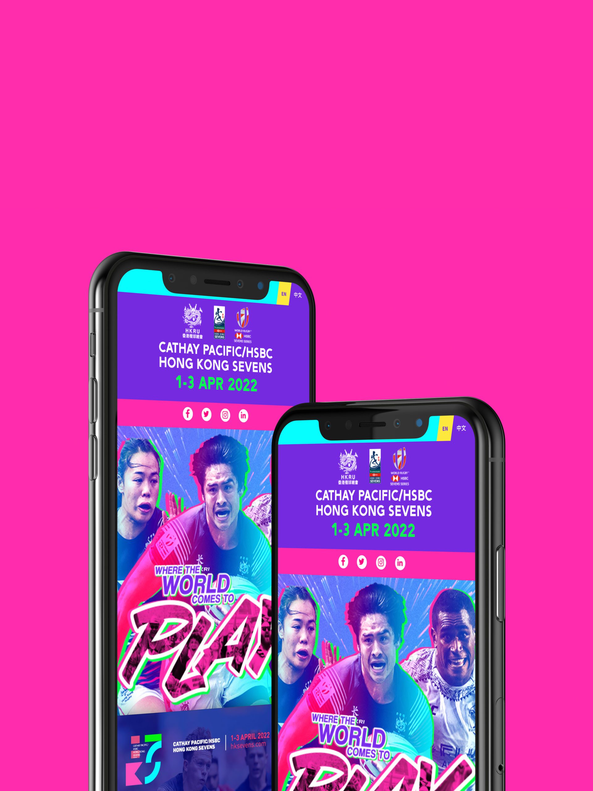
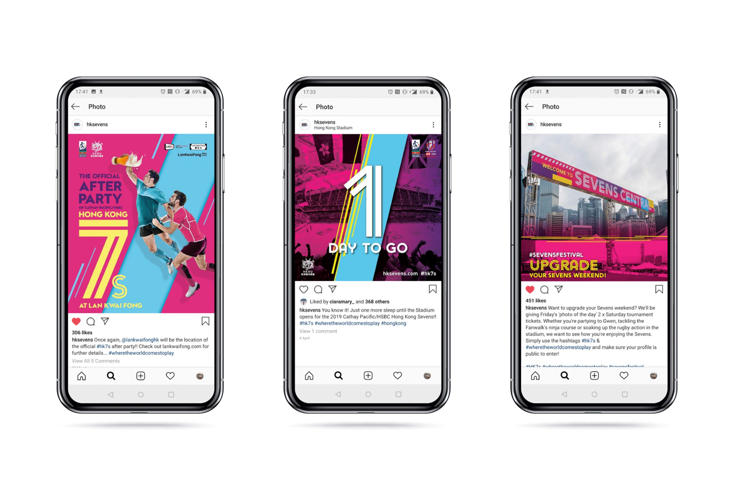
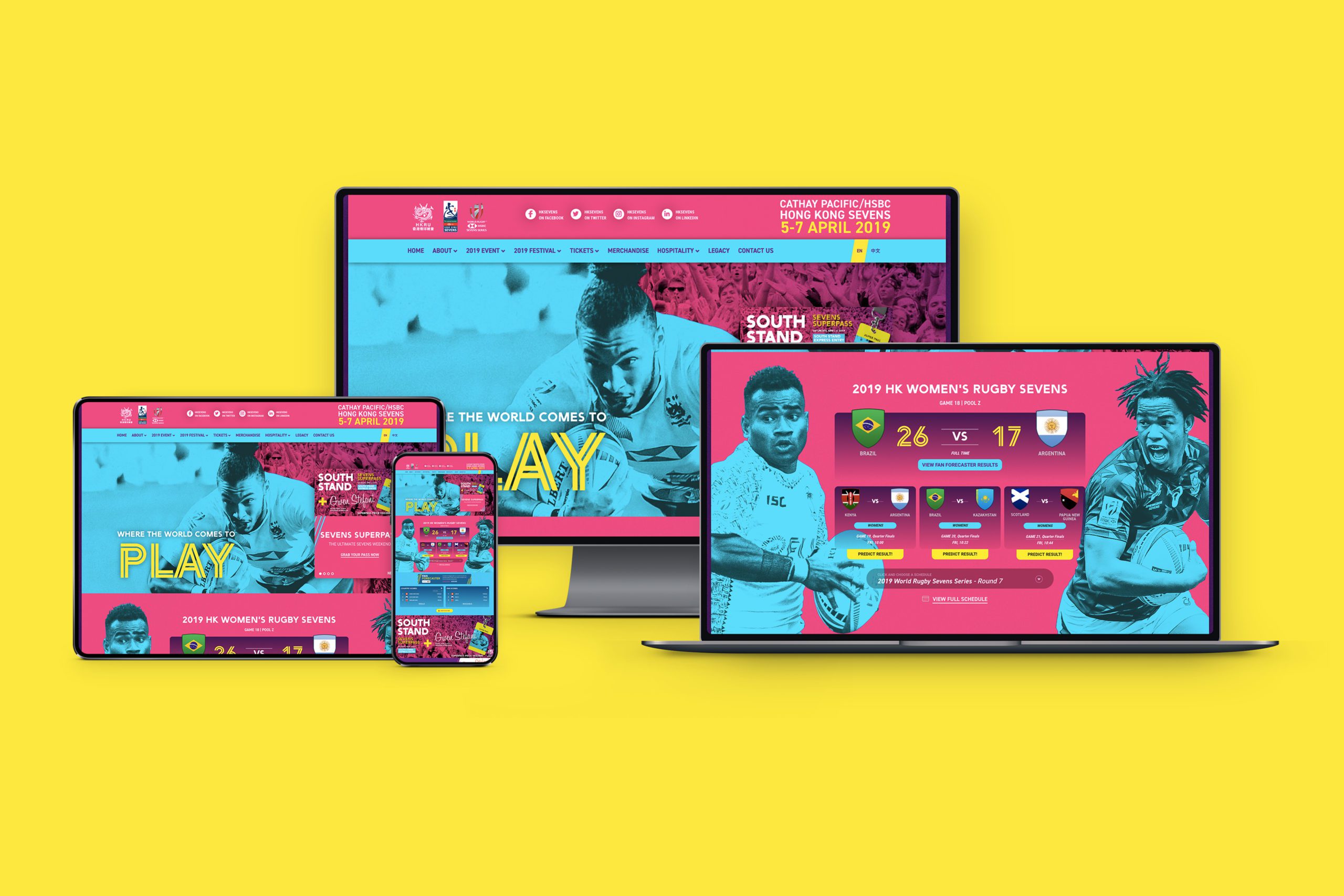
We focus on being able to produce a memorable visual that can be deconstructed for the client to use successfully across above and below the line advertising..*
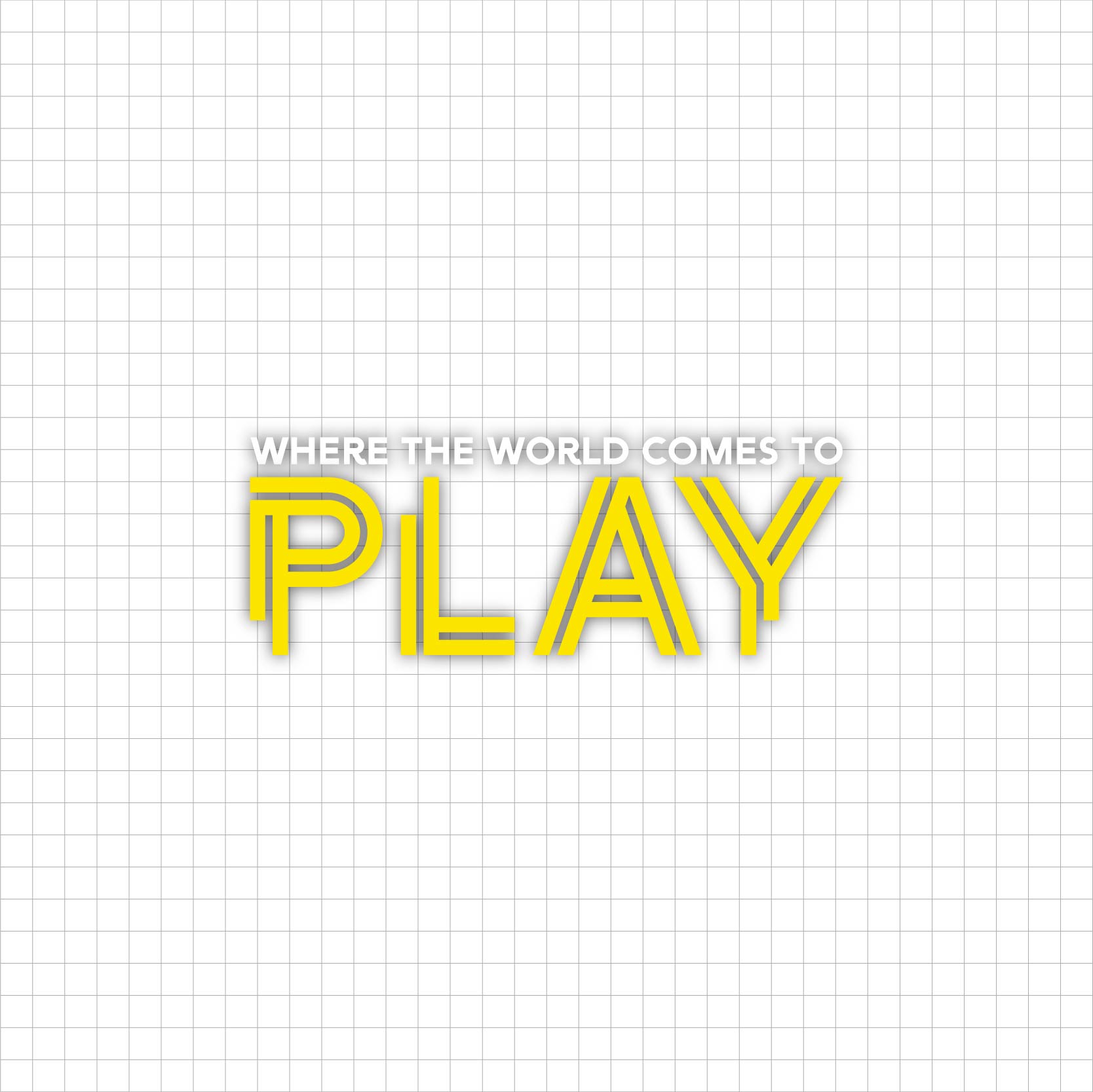
The Hong Kong Sevens tagline is “Where the world comes to play”. The word “play” reflecting the sevens rugby on the pitch and the fun aspects happening elsewhere. It’s a clever title and one which we have been happy to stick with over the years. So with the main focus of the visual being around the rugby players (for obvious reasons), we developed a new way to incorporate the fans, atmosphere and spirit of the tournament, and that was through the tournament tagline lock-up.
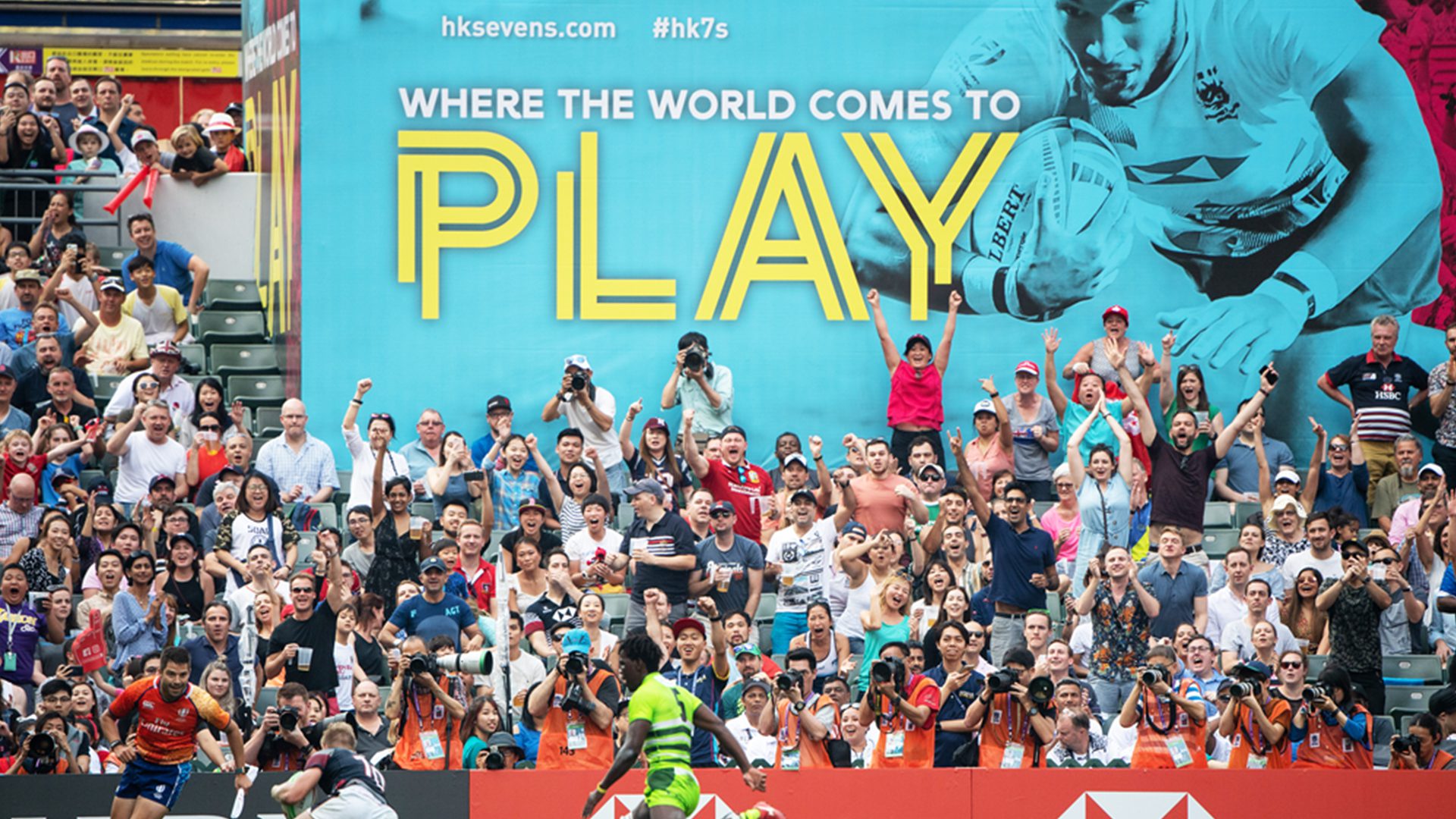
2019

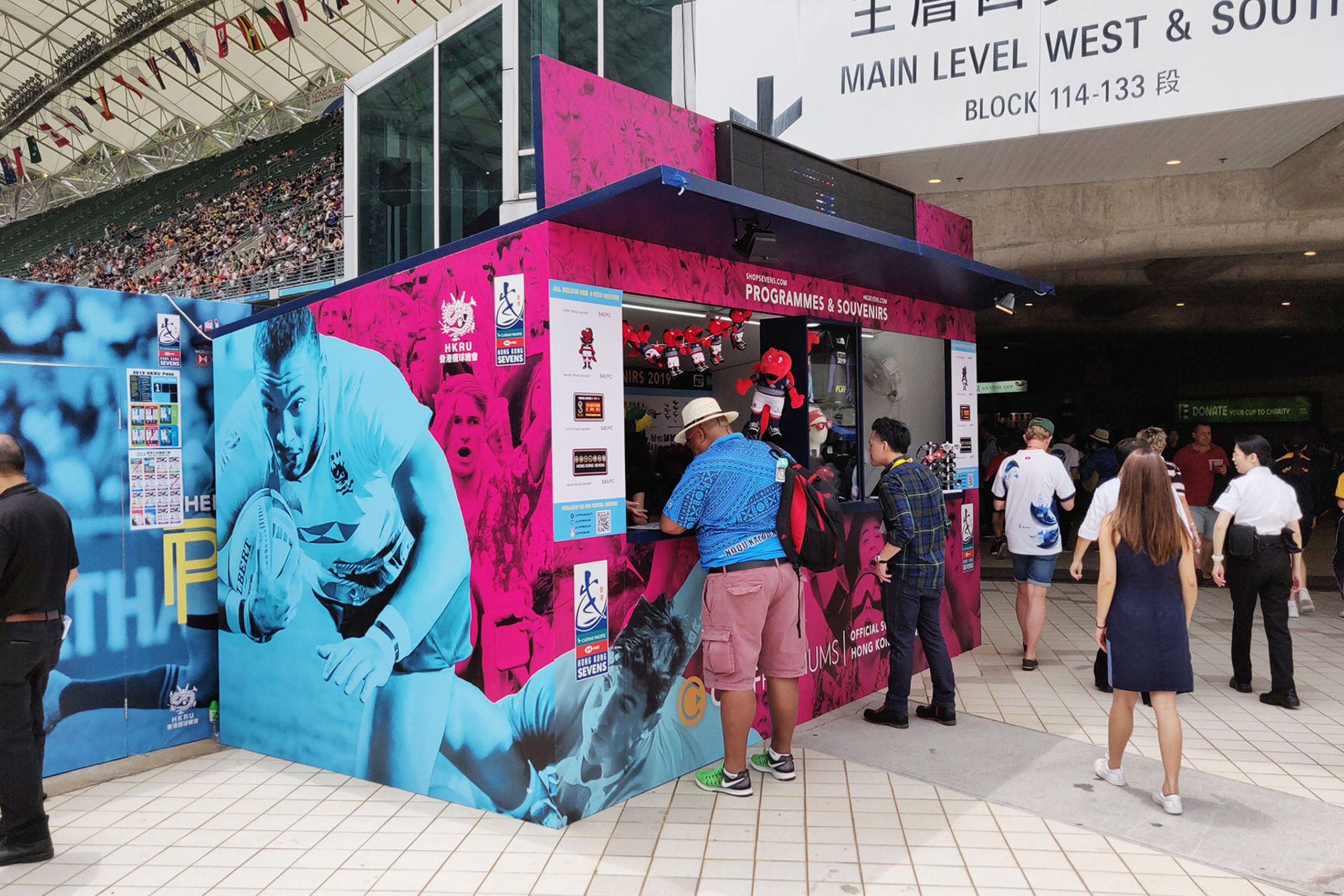
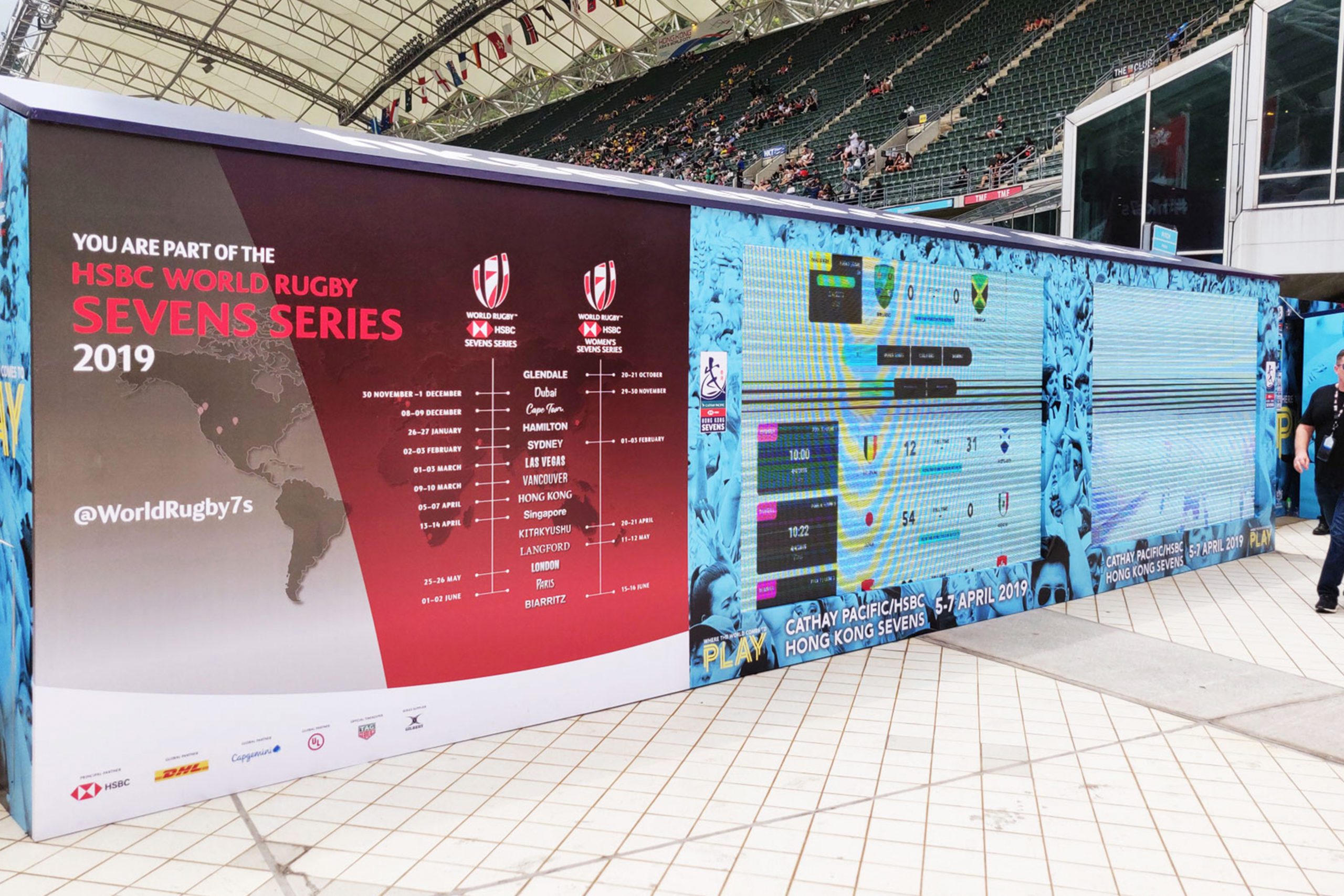
We take great pride in seeing our teams creative work across Hong Kong during the Sevens month. Walking into the stadium to see our teams hard work is truly special.
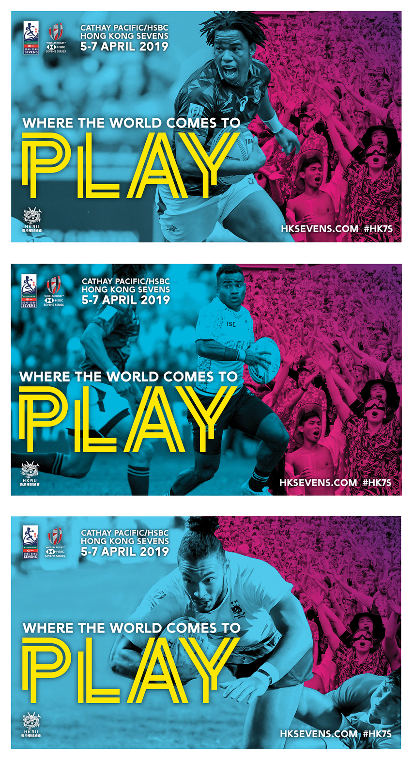
Reflect the energy of the tournament! The fast-paced nature of sevens rugby, the vibrancy of the city and the party spirit of the spectators.
