Year
2014-16
Services
- Branding
- Digital
- Marketing
Deliverables
- Brand Research, Proposition
- Brand Architecture
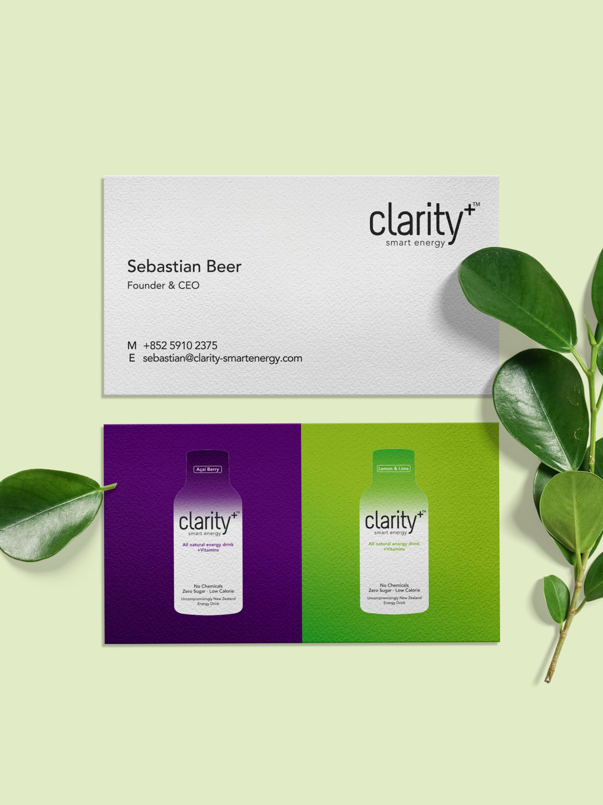
- Brand Identity
- Brand Guidelines
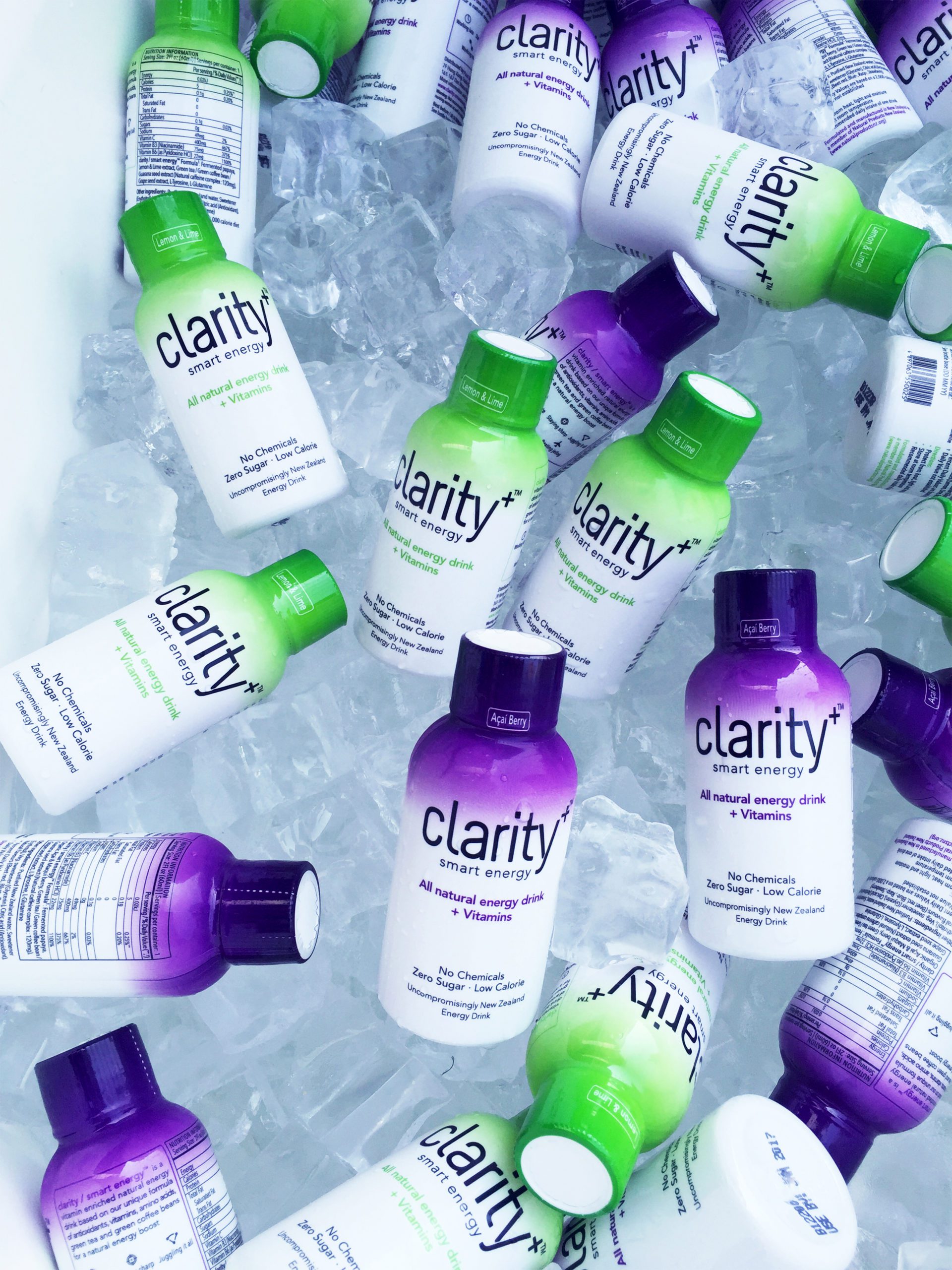
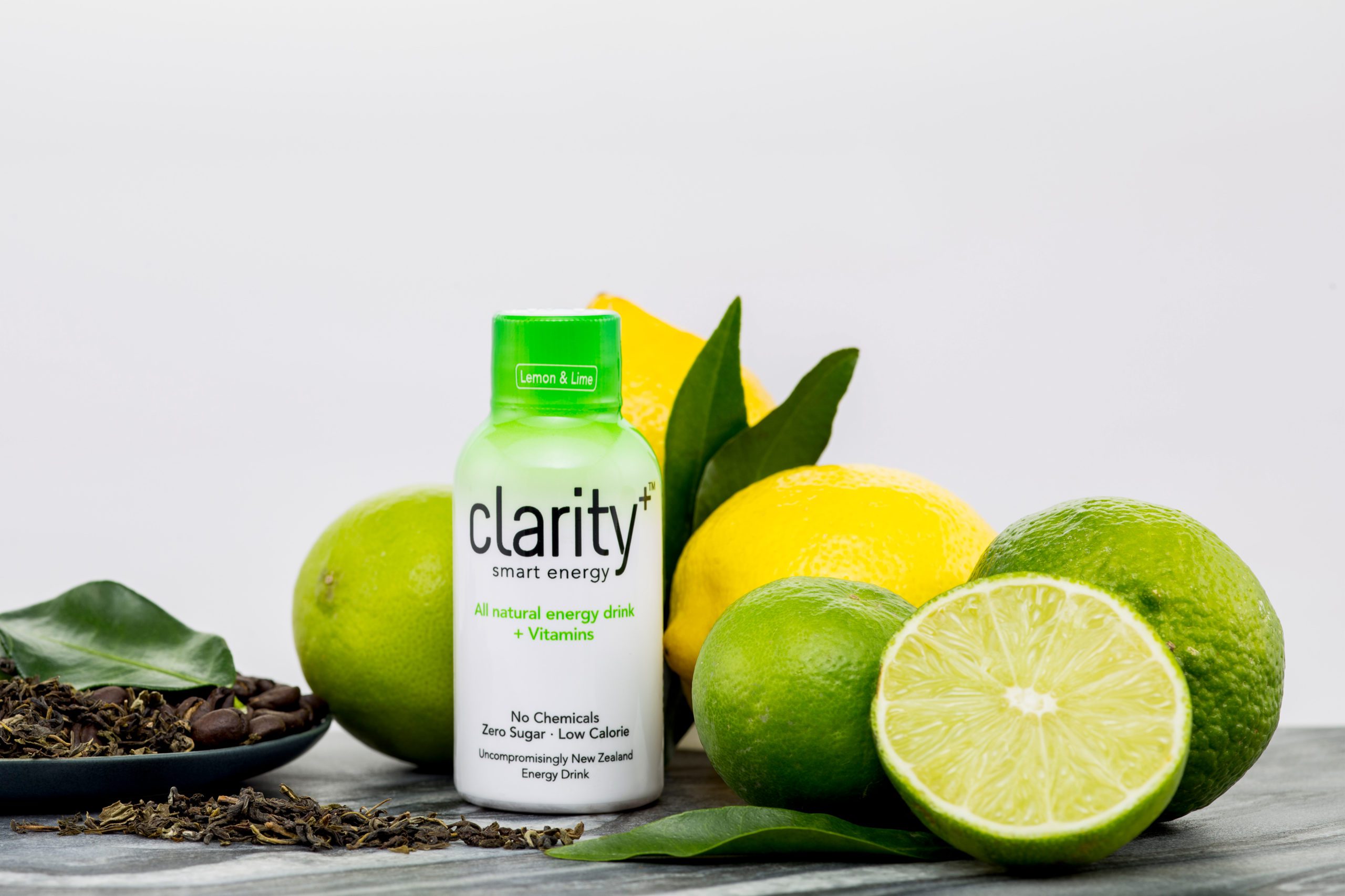
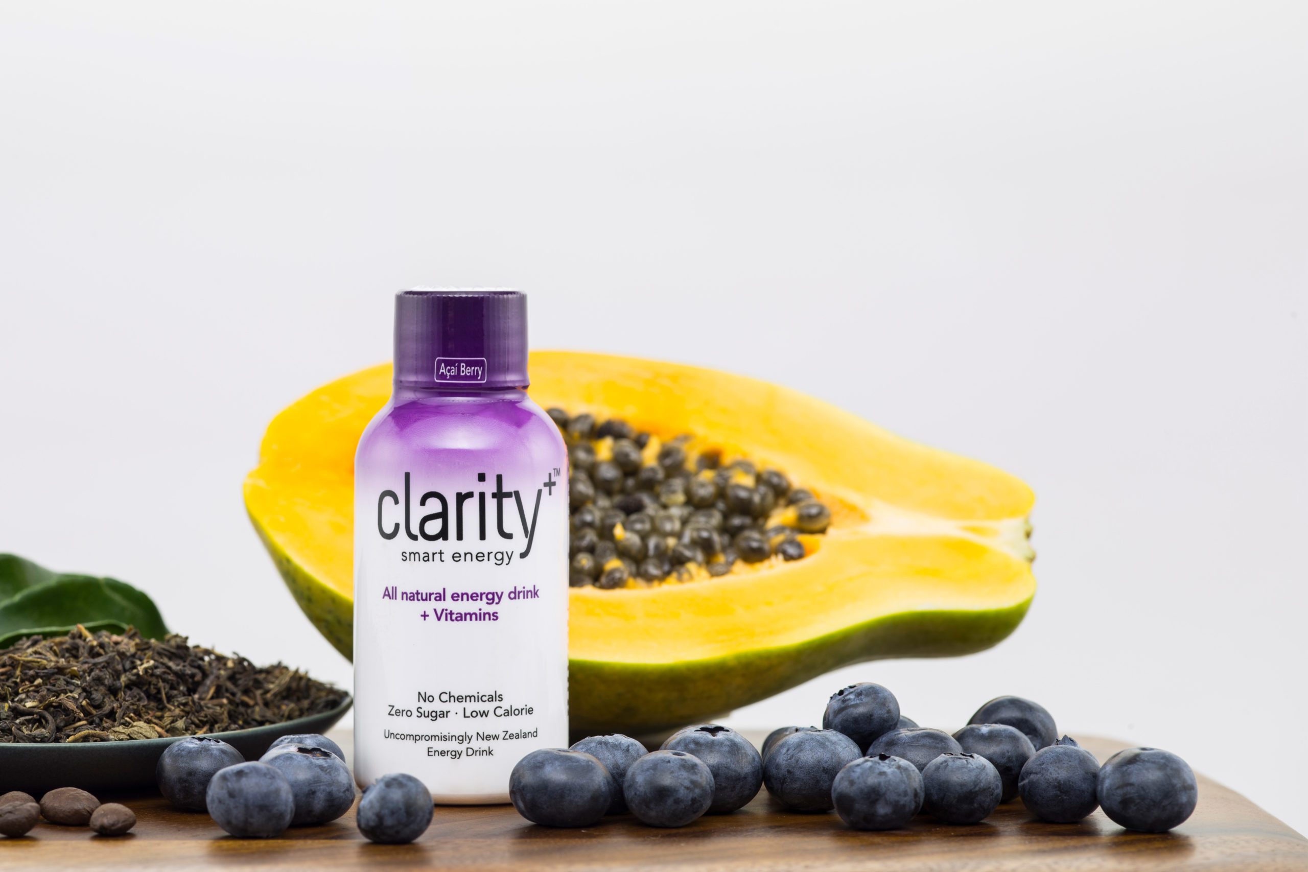
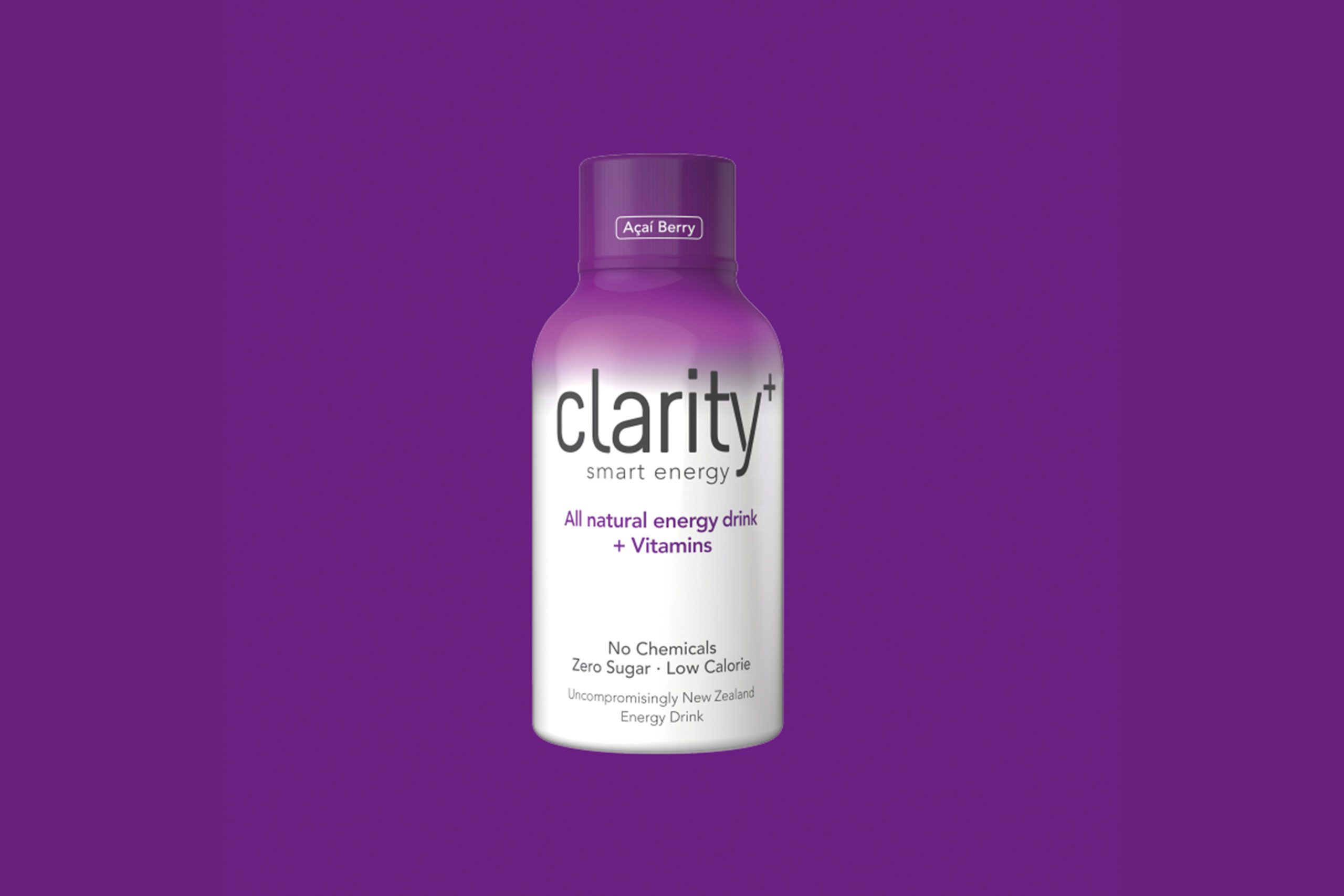
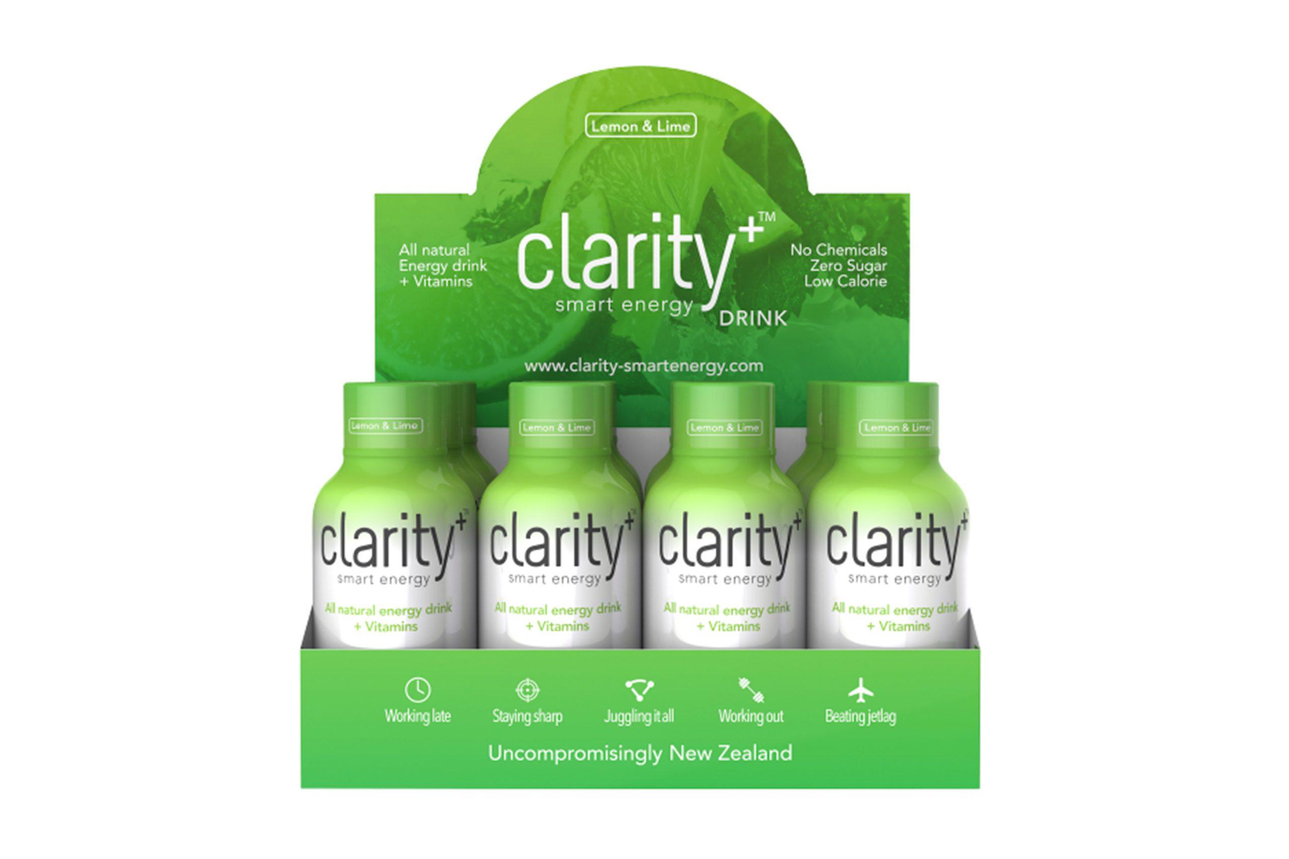
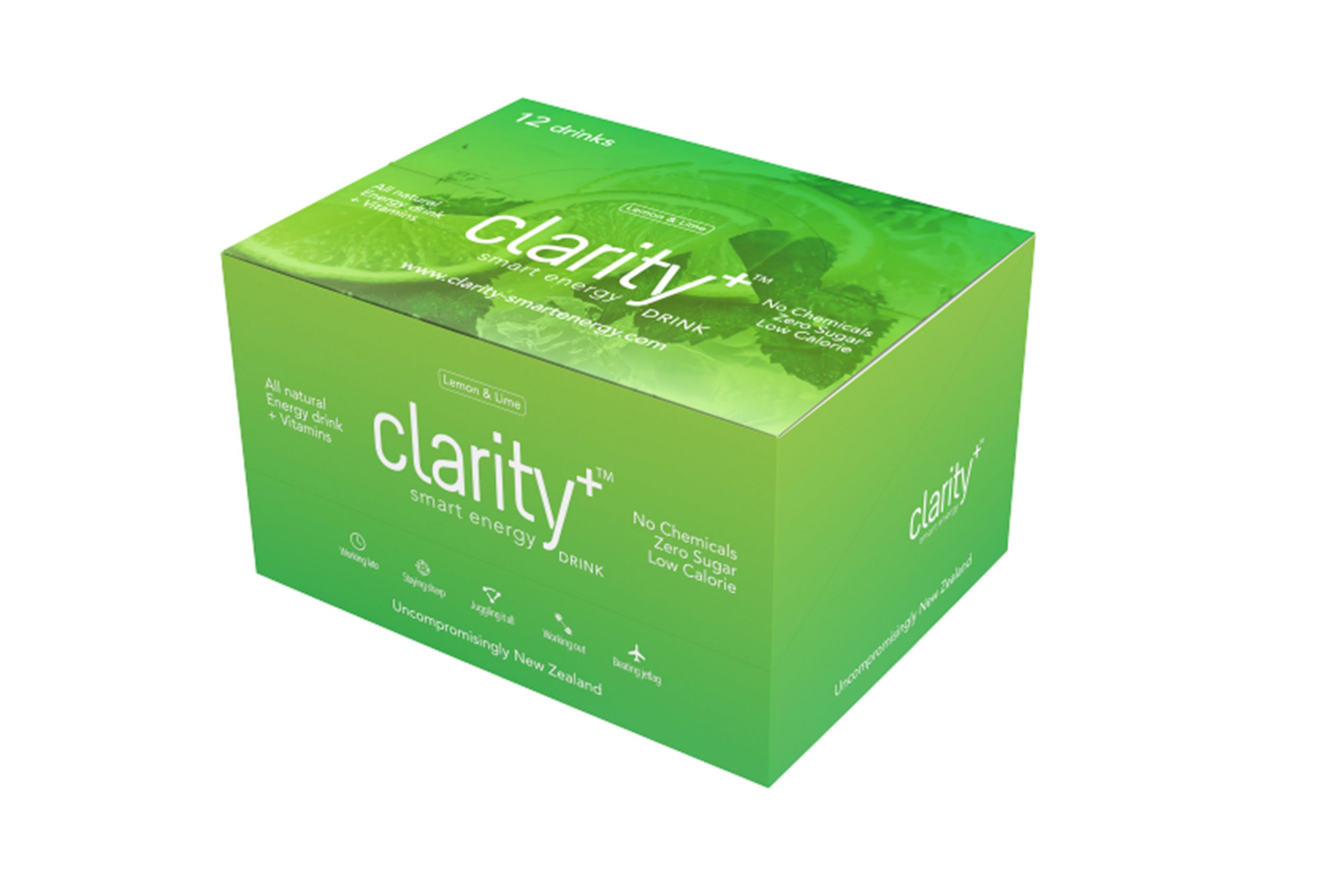
- Packaging Design
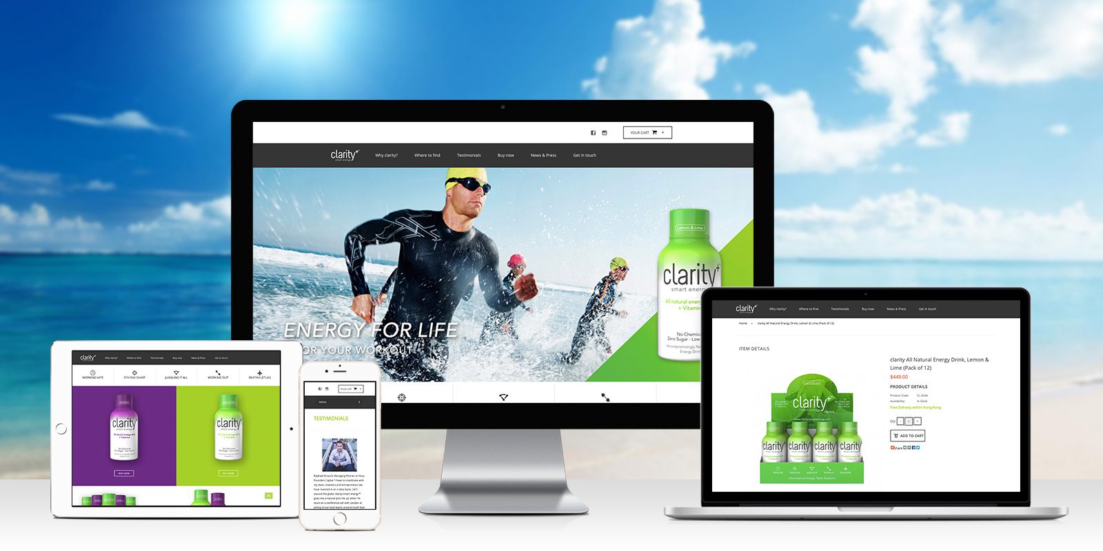
- Shopify Website
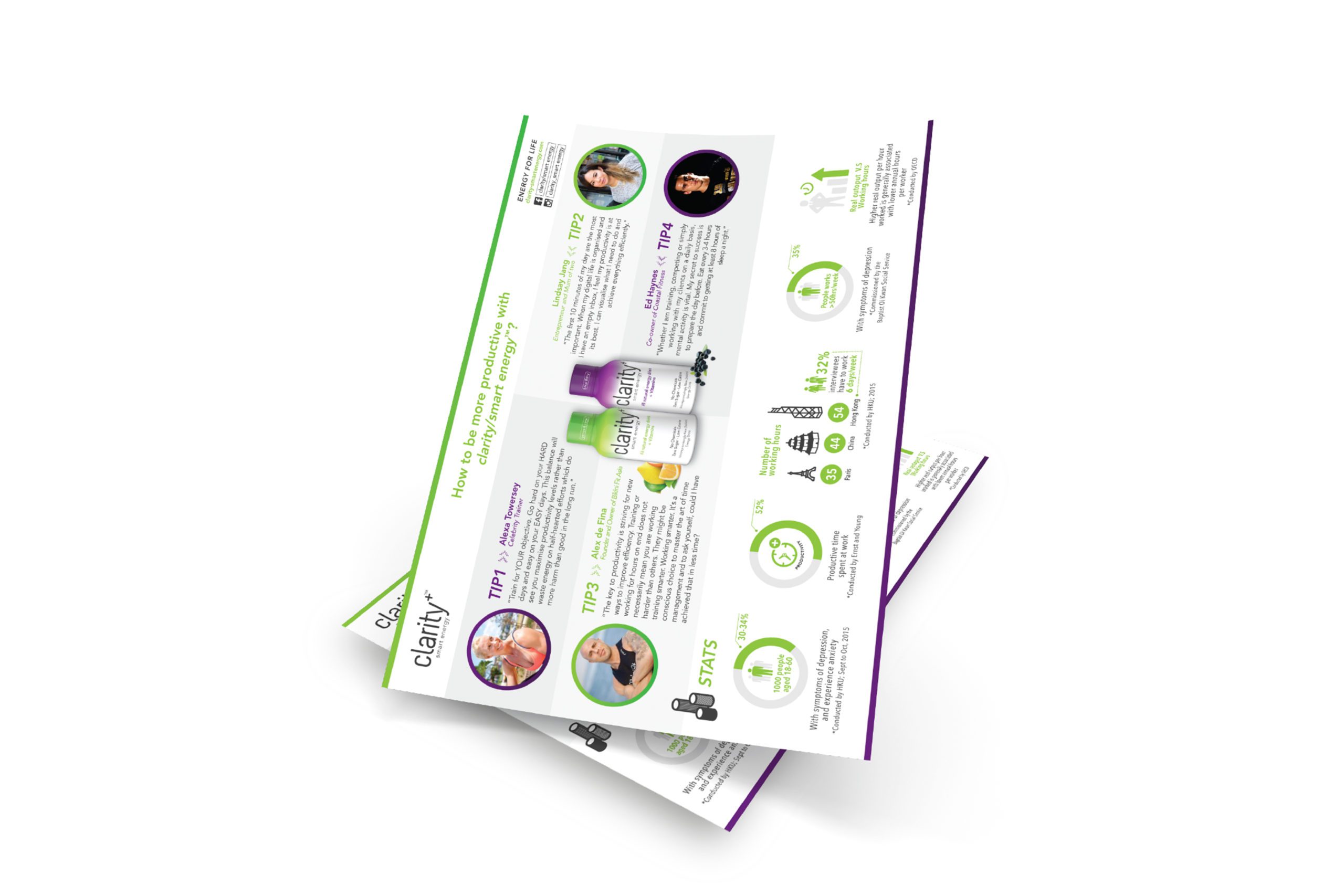
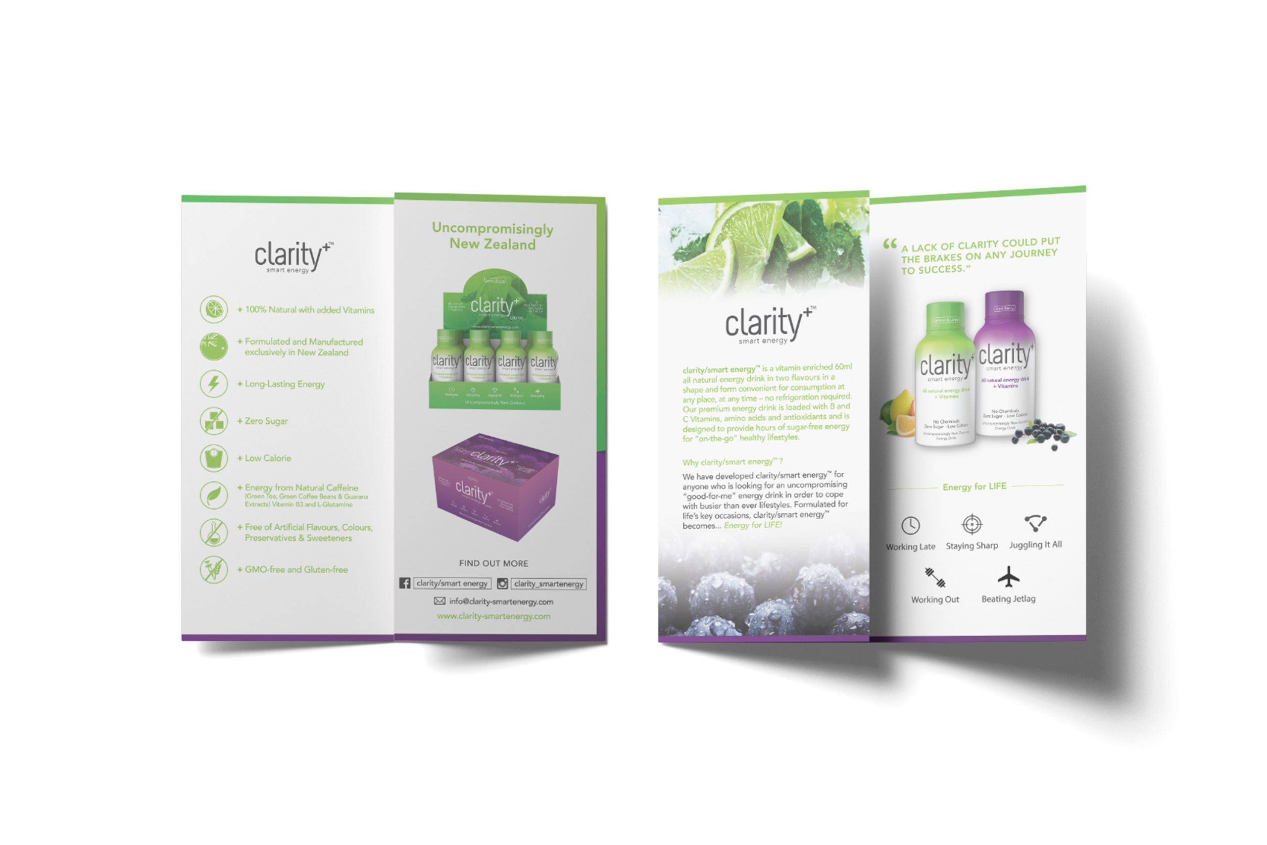
- Corporate Communications
- Print Production
Creating a smart-clear- energy drink brand for the Hong Kong consumer.
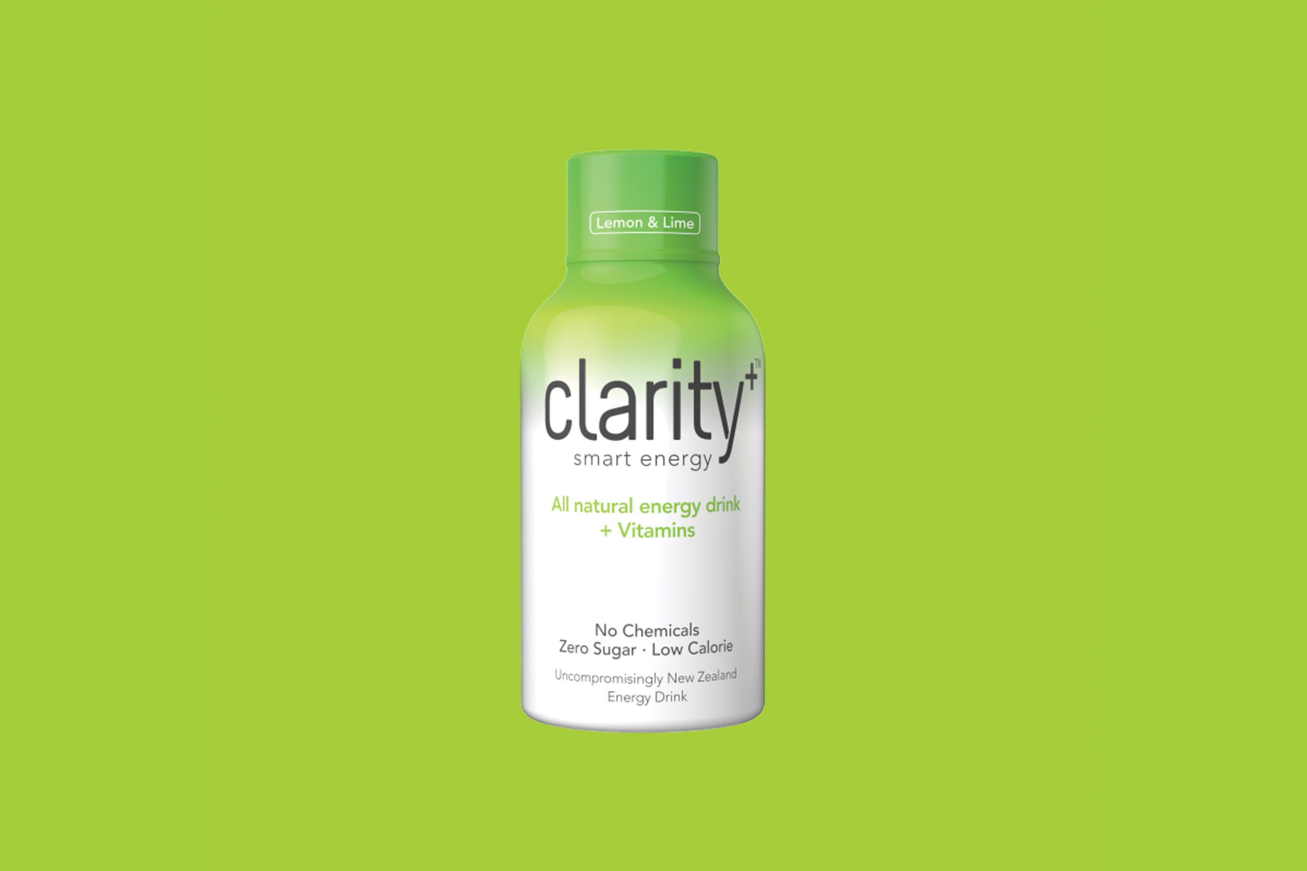
clarity/smart energy was founded by a group of people who are passionate about LIFE – highly energetic, hard-working and yet health-conscious. We were looking for healthy alternatives to stay ahead and alert, both physically and mentally, on days when tiredness catches up with us or sometimes we just need that extra boost for the gym session. We wanted something to carry around on us, just in case.
Start-up Business clarity/smart energy were recommended to ipulse. In the meeting with the owners, we were instantly excited to hear their vision for a new consumer brand to be launched in Hong Kong.
”I am very pleased with the outcome of all the design work as well as the website solution Steven and his team delivered for clarity/smart energy
Sebastian BeerFounder & CEO
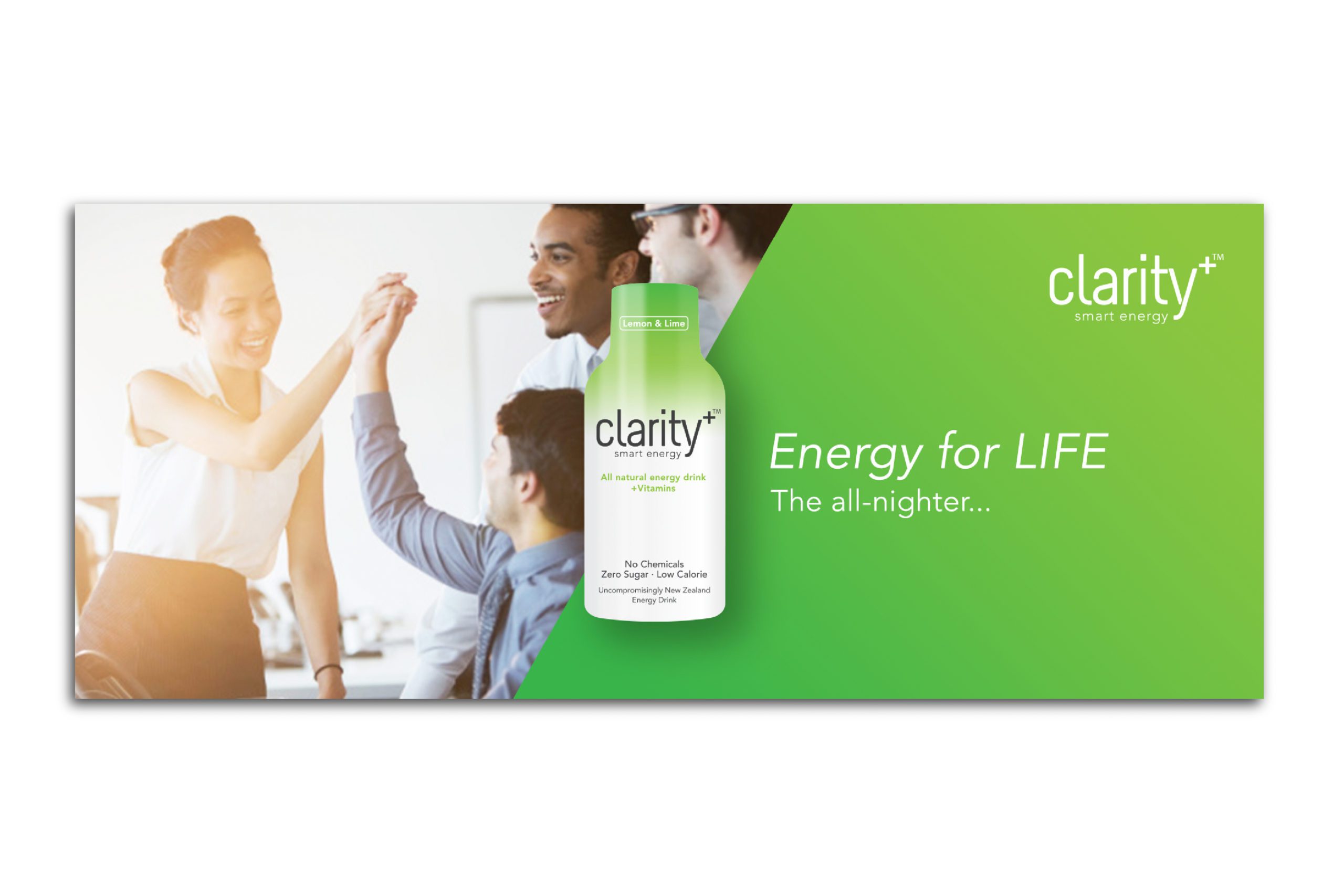
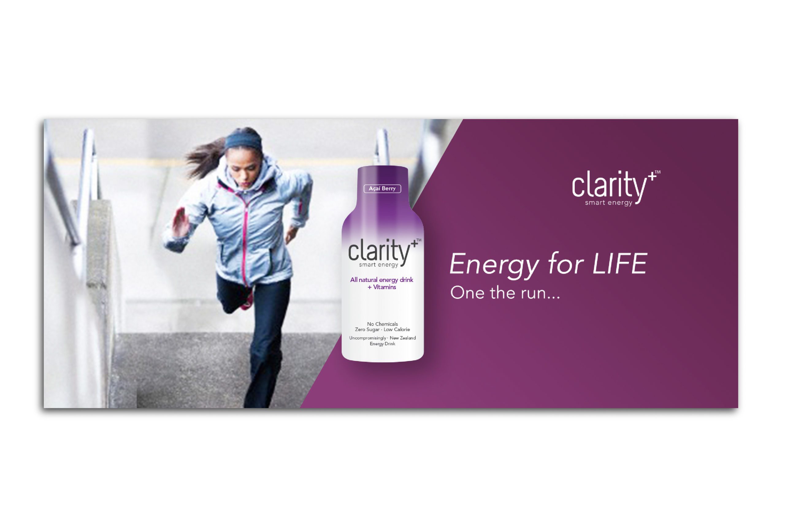
The modern and simplistic typeface, the use of the neutral/earthy charcoal combined with the vibrancy of the two drink flavour colours were all conceptualised based on the market insights gained by the team.
Color & material
We chose a neutral/earthy charcoal for the main brand identity colour for the name “Clarity-Smart Energy” then combined this with the vibrancy of the two drink flavour colours which were chosen based on the flavours “Acai Barry” & “Lemon & Lime”.
Greyscale K90%
#414042
Green
#A6CE39
Purple
#6A2181
The Challenge
The brand DNA had to run throughout and be consistent.
The initial briefing outlined the needs for iPulse to create an outstanding brand, a range of packaging and an e-commerce website. The client wanted a clean look and ultimately that would be successful in selling into the Asian market.
The Solution
We started with deep market research and then evaluated this with the client.
Working this way gave the client great confidence in the look of their new brand and we extended the elements of the brand into the packaging and website design. The website was needed to built with cost and scalability in mind so we suggested an Opencart platform site and built in online payment gateways, which has the ability to move into multiple languages.
Typography
Avenir
A B C D E F G H I J K L M N O P Q R S T U V W X Y Z
a b c d e f g h i j k l m n o p q r s t u v w x y z
Myriad
A B C D E F G H I J K L M N O P Q R S T U V W X Y Z
a b c d e f g h i j k l m n o p q r s t u v w x y z