Room to breath

Logo Mark
Most logos are comprised of both text and images to form the identity as we know it. The best brands we are most familiar with will have four to five versions of their company logo when they feel it is the most appropriate. It’s not essential to go to this extent, but we always recommend considering your logo’s full range of applications.
Apple, Nike, and Airbnb are all instantly recognisable by their logo mark without the accompaniment of their company name. Granted, it has taken them significant time and money to get this right, but there’s no harm in standing on the shoulders of giants!
![]()
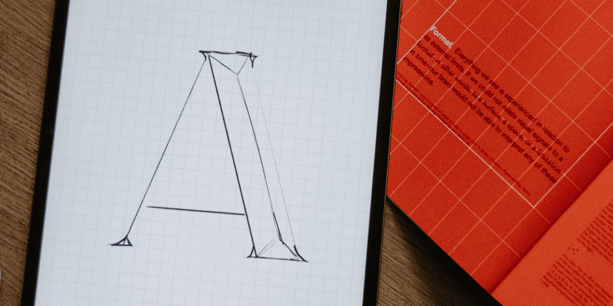
Font & Colour
Choosing the proper typeface and colour for your logo is critical in developing a solid brand identity. However, determining which fonts and colours are adequate may be difficult.
Stick to clean, easy-to-read fonts that will be legible in small sizes. Avoid using too many different fonts in your logo. Try to stick to no more than one or two fonts maximum. Look for a font that’s part of a family, meaning it has different weights (book, semi-bold, heavy) to cater to the broadest applications.
When it comes to colours, do your research. What industry are you targeting? Standing out is one thing, but it has to be done correctly. Stay away from using too many colours in your logo. Two or three colours should be sufficient. That being said, your logo should always work in one colour.
Remember, your logo is often the first impression potential customers will have of your business, so make it count. These are some of the markers we always check through when designing logos for startups. Often they enter a popular or even saturated market where standing out is essential, and a solid, professionally designed brand identity can help!

Consistency
A topic we are heavily invested in. Consistency is one of those disciplines that seems easy but requires commitment and trust in the process. Brand guidelines are great and a must-have when producing a new company identity, but they must be understood throughout your organisation, so everyone is singing off the same hymn sheet.
We understand that you may not have the time you’d desire to get things right before they go out or that you may need to double-check the photos on your website are edited correctly. It might appear harmless, and no one will notice, or it’ll do for now, and you’ll get back to it later, but believe me when I say that they will.
Output
When you receive your completed logo, you should also get various file formats to use. This is important for two reasons: first, you can use the logo in different places and applications, and second, you have a backup in case something happens to the original files. Make sure to ask the designer for the following file types and keep them safe:
- EPS (Encapsulated PostScript) – a vector format will allow you to scale the logo up or down without losing quality.
- PDF (Portable Document Format) is a standard format used by printers; it ensures high-quality output no matter the type of printer used.
- JPG (Joint Photographic Experts Group) – is the most common image file. Great for manageable size but uneditable and becomes pixelated if enlarged beyond the set sizing.
- PNG (Portable Network Graphics) – a valid format if you wish to apply your logo with a transparent background. Great for digital applications.

We have designed many logos for startup businesses over the years and would be happy to discuss our experience with you. Get in touch today to see how we can help you on your startup journey.
Alternatively, check out our Logo Design for StartUps briefing document to help you ask yourself some questions about your business and what you want from your company logo.